THE ART OF SPARTA
On board Heesen's 67-metre superyacht Sparta
RUBEN GRIFFIOEN
From the chill January quayside of the Rotterdam harbour where 67-metre Sparta is undergoing her last checks, there is little hint of what lies in store. In the light of a watery dawn, Heesen’s largest steel yacht is keeping its secrets to itself.
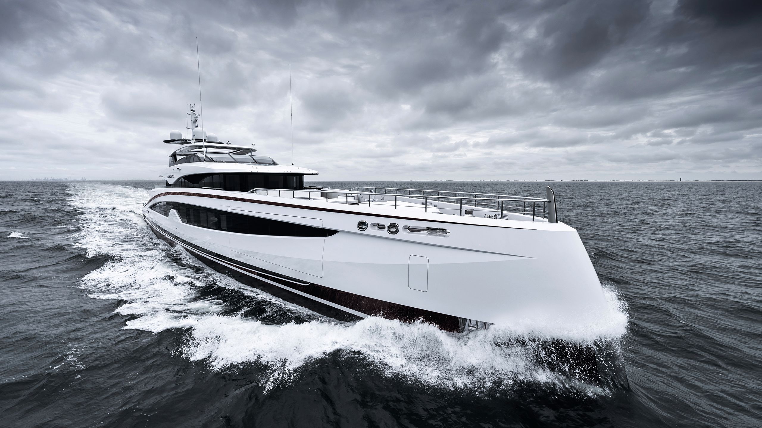
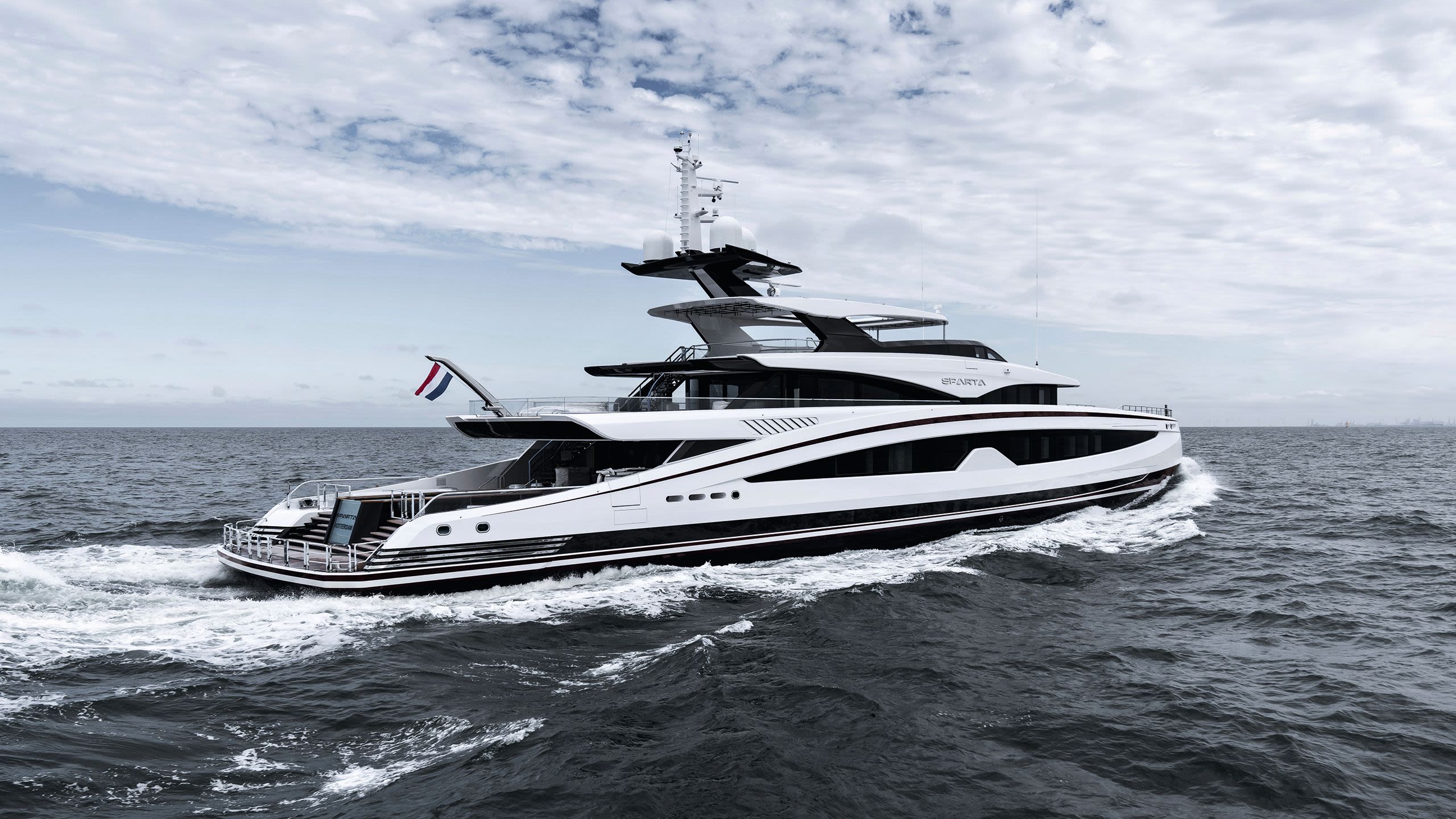
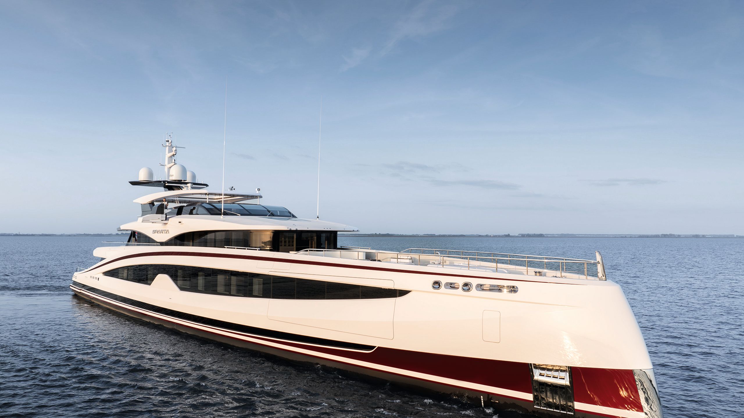
The Venetian red stripes that flash across her topsides just look black, and I will have to wait until the sun rises much higher before I can appreciate the fetching “swoosh” that knits the decks together and the purposeful reverse bow.
Sparta is a winner at the 2024 World Superyacht Awards
You can view the rest of the winners below
We enter via a crew area painted in businesslike beige. Only then, with our shoes safely removed and coats stowed, do we push through a heavy service door onto the main lobby – and into a wonderland of decorative design.
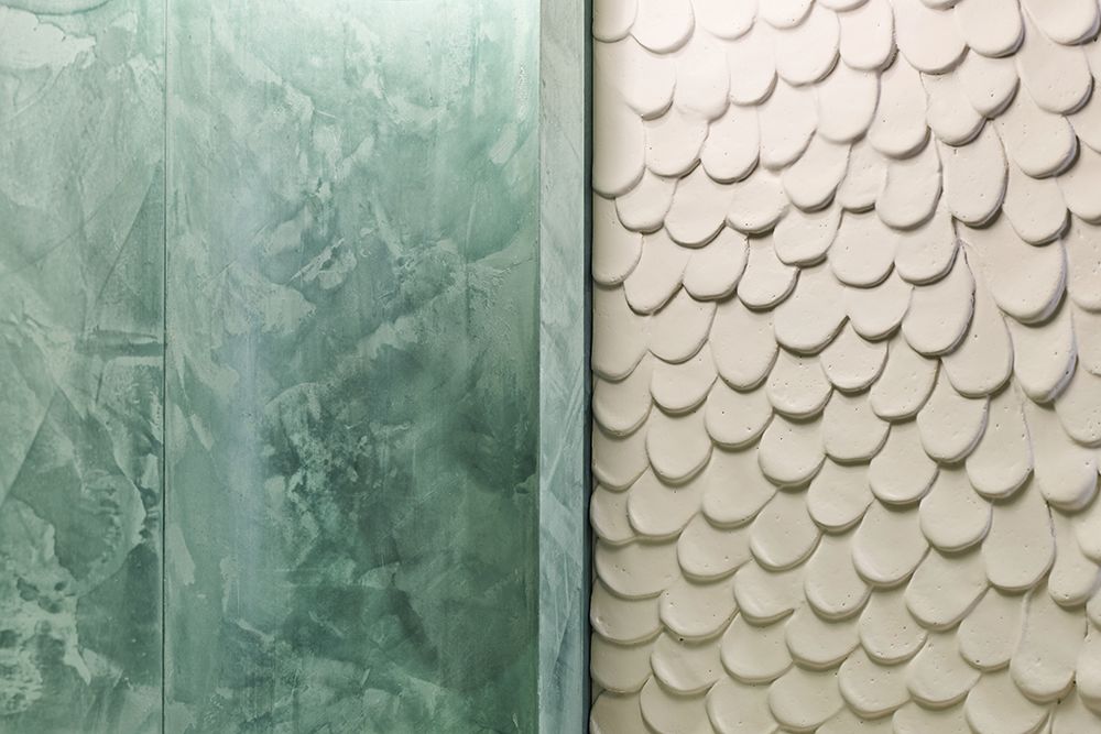
This is a boat that’s all about unabashed beauty and artisanship. The name Sparta, with its implications of asceticism and a disdain for the artistic, is a misnomer that has utterly wrong-footed me from the dockside.
DAVID CHURCHILL
DAVID CHURCHILL
DAVID CHURCHILL
DAVID CHURCHILL
DAVID CHURCHILL
DAVID CHURCHILL
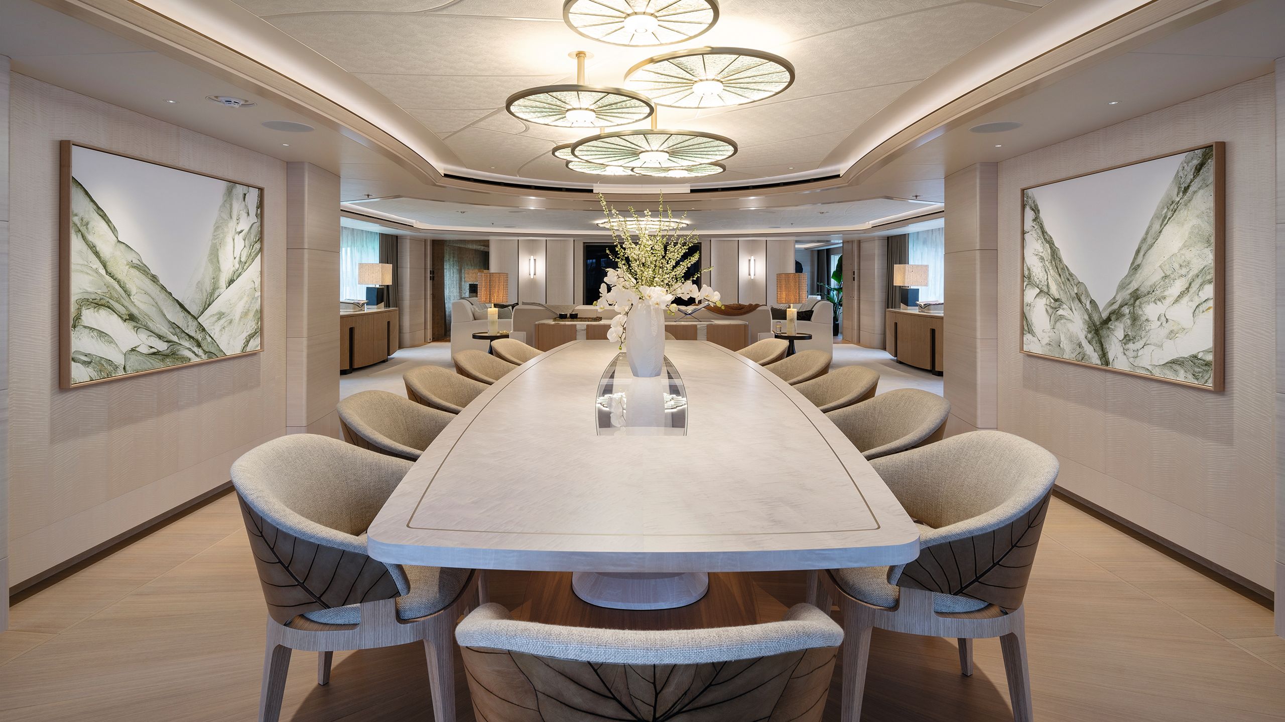
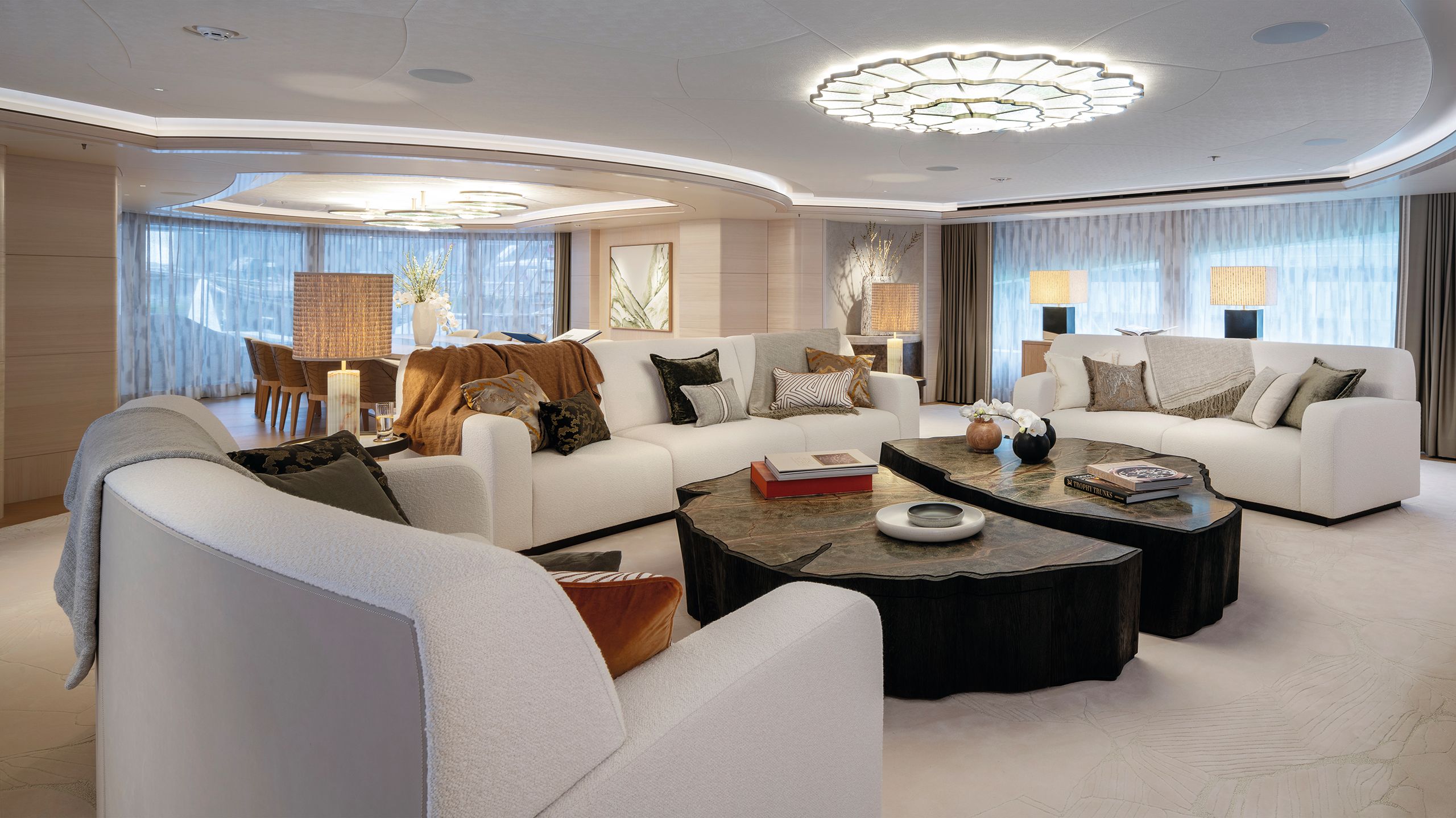
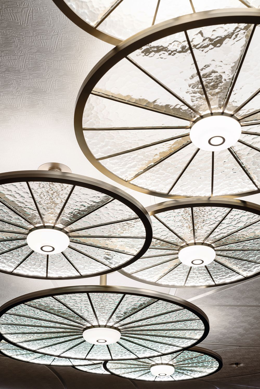
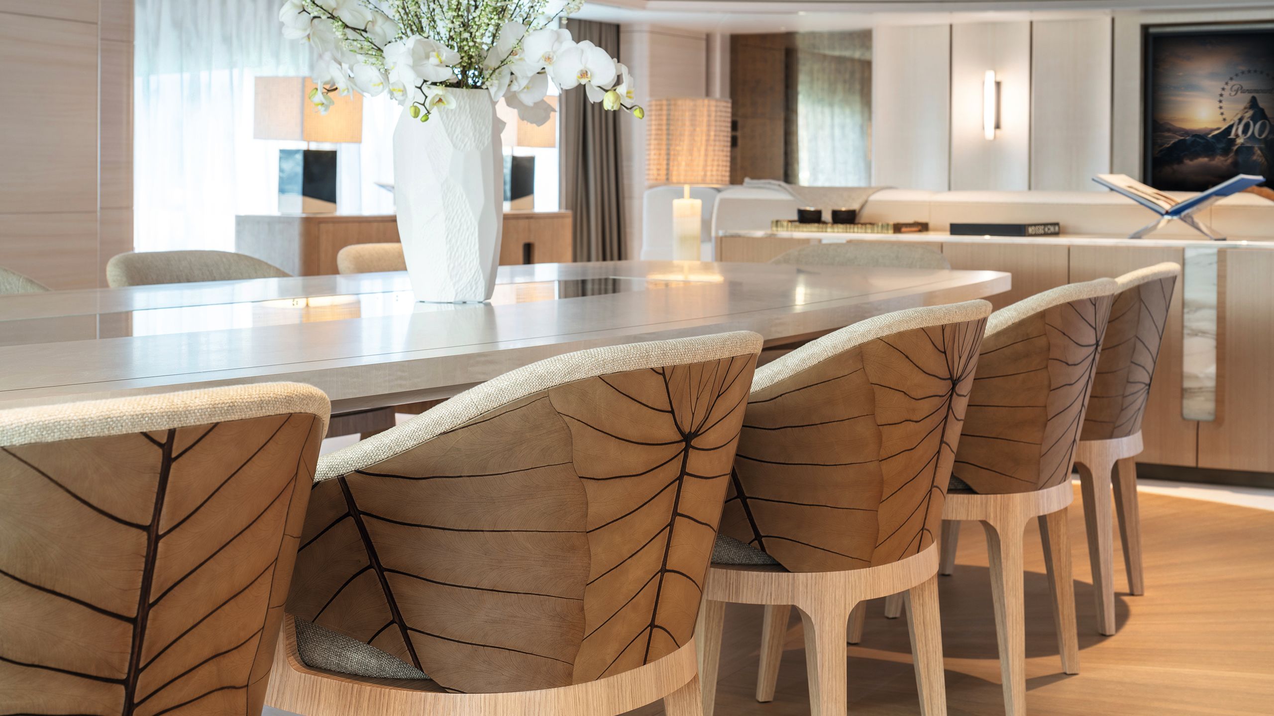
Around the figured sycamore dining table, the chair backs are embossed with real palm leaves (top); the main saloon features a relaxing sofa and custom-made wool-silk carpet by Tai Ping (bottom left); the lighting above the main deck dining area (bottom right)
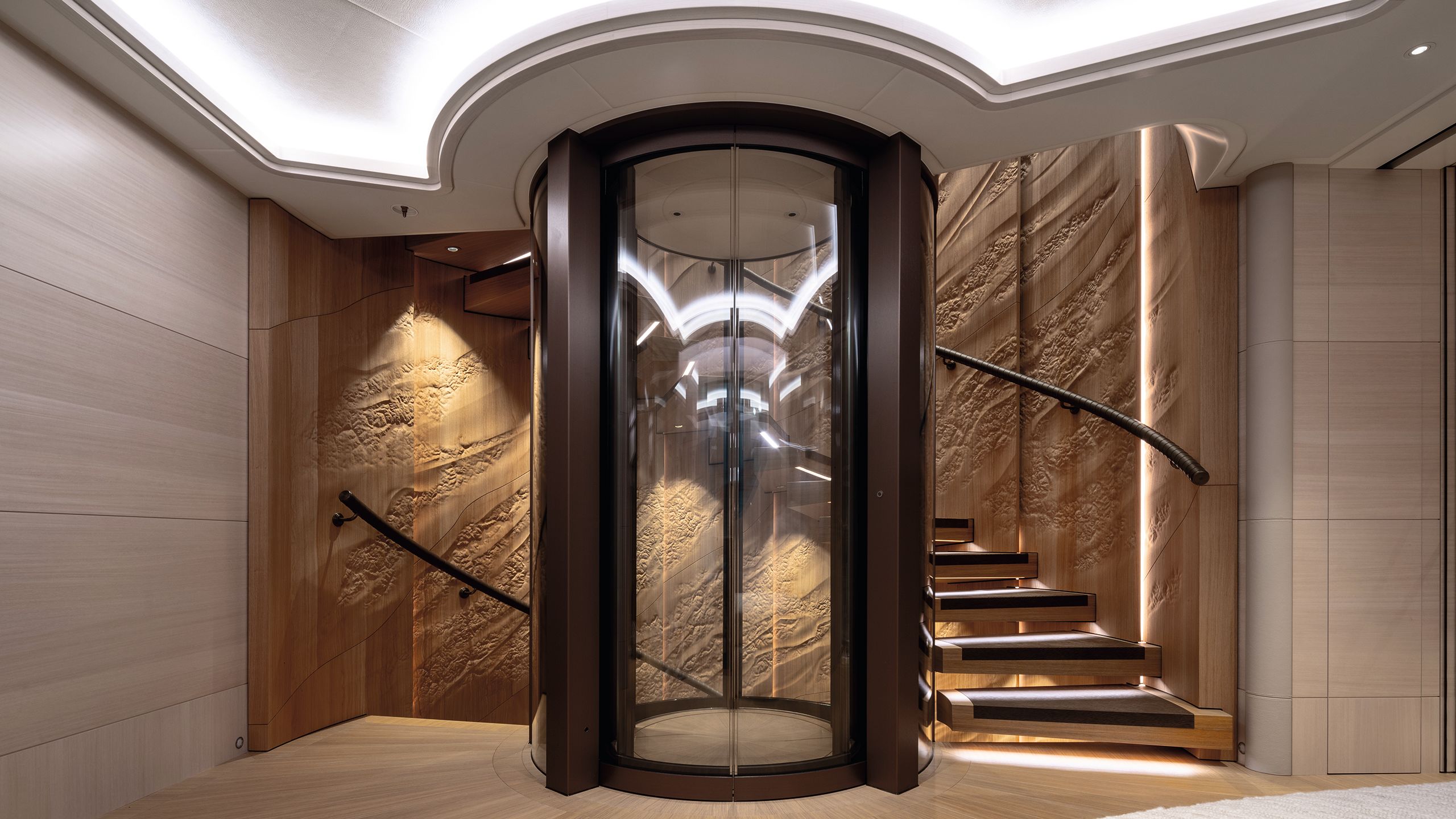
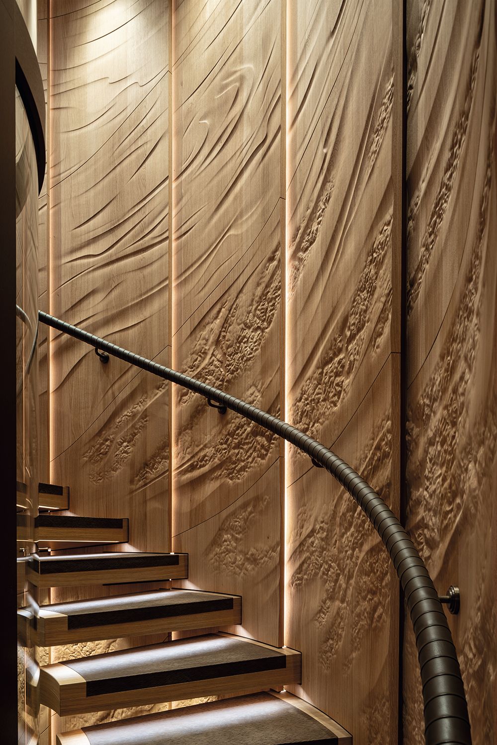
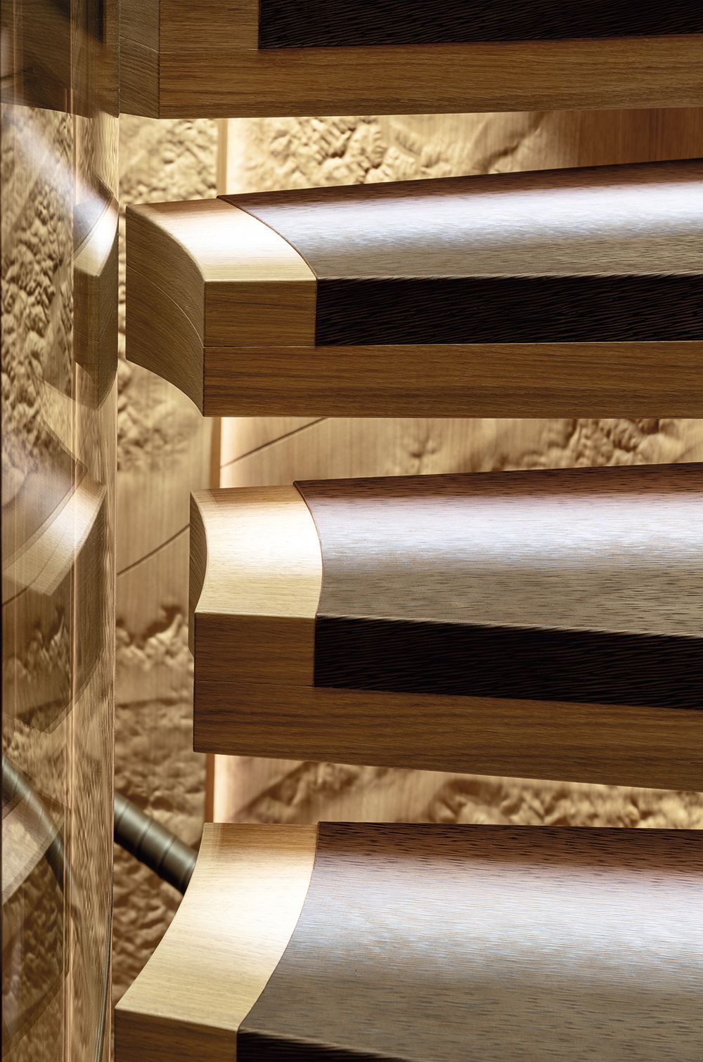
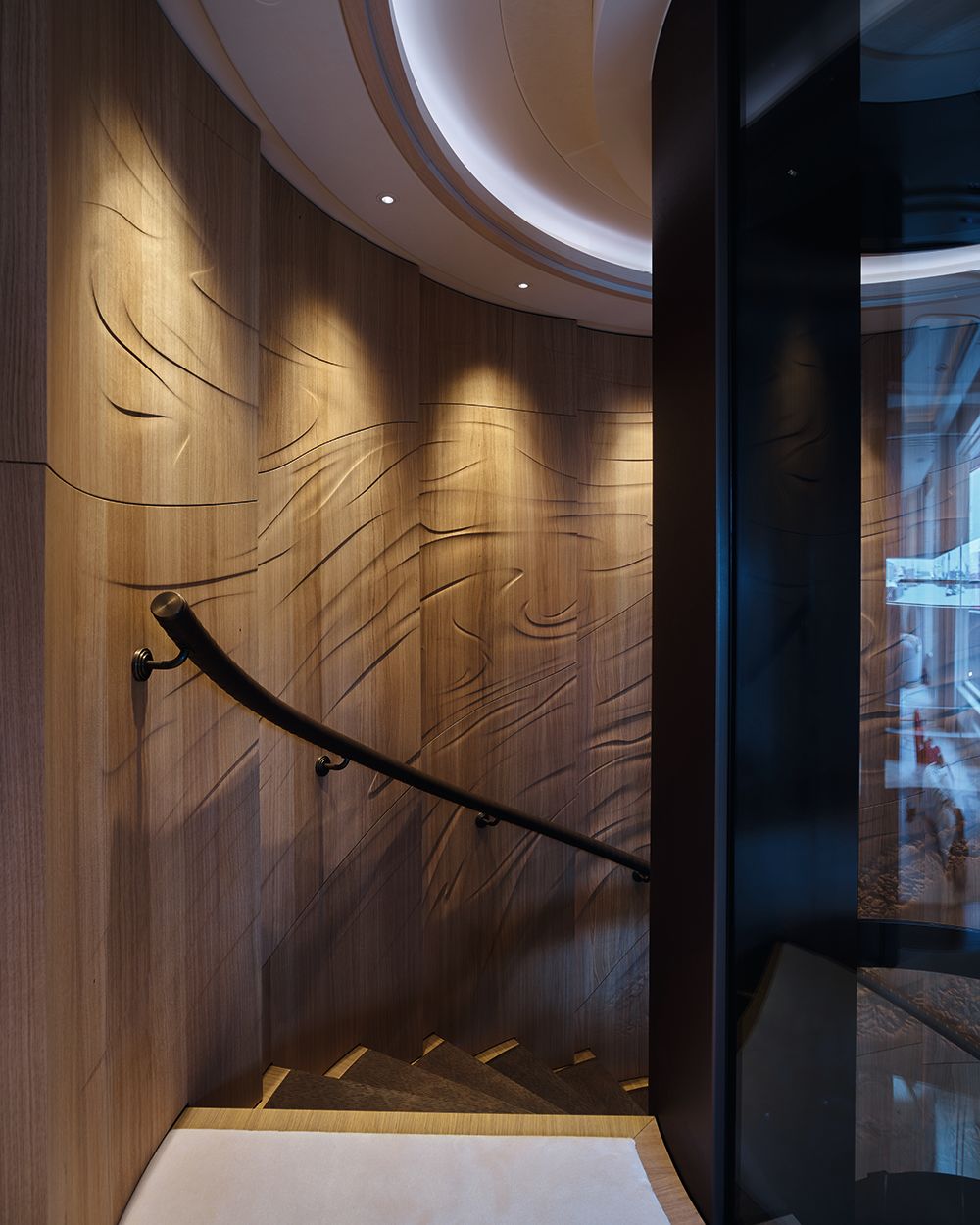
The magic of Winch Design’s interior begins to unfurl as soon as we come upon the main staircase, which almost pulses with organic life. Winding through three decks, it is panelled from top to bottom with a carved oak frieze from Hull Studio.
The motif changes from ripples in a sandy seabed on the lower deck to the spume of a breaking wave and on up to the playful currents in a gust of wind. Earth, water and air – the three elements characterise the whole interior.
“The staircase is carved in three different ways to tie all of these elements into one, rather than letting them be seen in isolation,” says Joost Roes, Winch’s lead interior designer on the project. “This is something fluid yet connected.”
ALEX HULL'S STAIRS
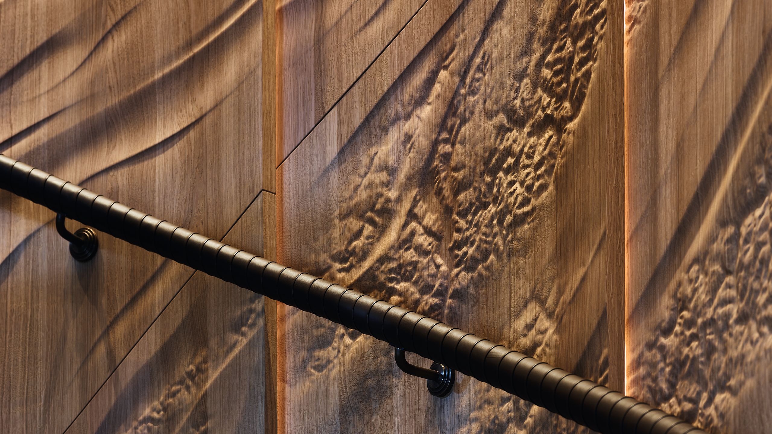
“We started literally with trees,” says Alex Hull of Hull Studio. “Five oaks were supplied to us air dried and cut into 18mm-thick planks. They’re from a sawmill in France, all grown in the same area to manage colour consistency.
“At the workshop we went through a lengthy process of selection, trimming all the timber down into smaller cuts – 120mm wide and 12mm thick. Then it was like a great game of Tetris – we laid everything out on the workshop floor and moved it round for a couple of days until we could see how it would work.
“Every panel had to be shaped on the back face first, because the staircase is curved. There’s a substrate panel that all that oak is glued to, then the oak pieces are cut to that exact diameter.
“All of the back facing was run by a machine, but the gluing is all by hand. It’s really important for the quality, because you want a seamless joint line. I’m obsessed with maintaining a natural look – not an oak floor stuck to the wall.
DAVID CHURCHULL
DAVID CHURCHULL
DAVID CHURCHILL
DAVID CHURCHILL
DAVID CHURCHILL
DAVID CHURCHILL
WINCH DESIGN
WINCH DESIGN
“Meanwhile, our team was busy doing the digital design. The whole artwork was first carved digitally by hand, using a digital pen and tracker pad to achieve the different weights and textures.
Instead of the traditional 3D modelling technique, we used an approach seen in special effects design for games.“The original concept came directly from Winch as a series of images. We did a lot of sketching around it to create a full-scale flat drawing.
“We developed a flow line where waves lead into the staircase at the bottom, the theme follows up through earth to the air texture, which levels out and leads you out of the staircase.
There is a lot of development work to achieve the texture we wanted from the milling machine and get the clarity and definition. Then there’s a long process of hand sanding. We worked from Heesen’s production drawings, so all panels were trimmed to size beforehand; they had to fit seamlessly.”
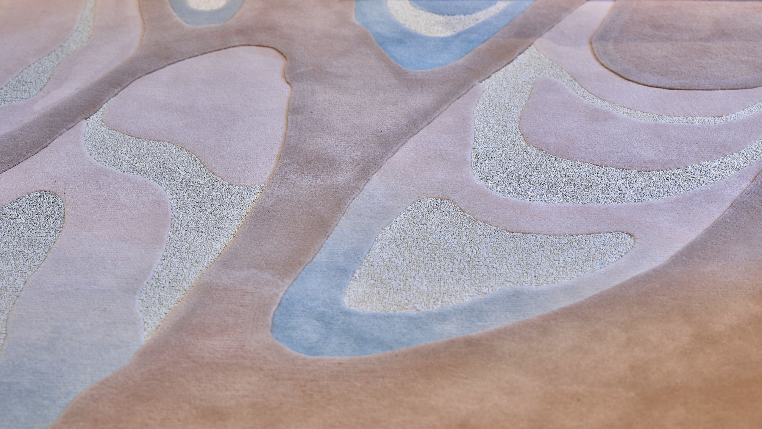
A few steps further and we are into the main saloon, where my feet sink into a custom-made wool-silk carpet by Tai Ping. Built up in layers from a woollen base, you feel the carpets on Sparta every bit as much as you see them.
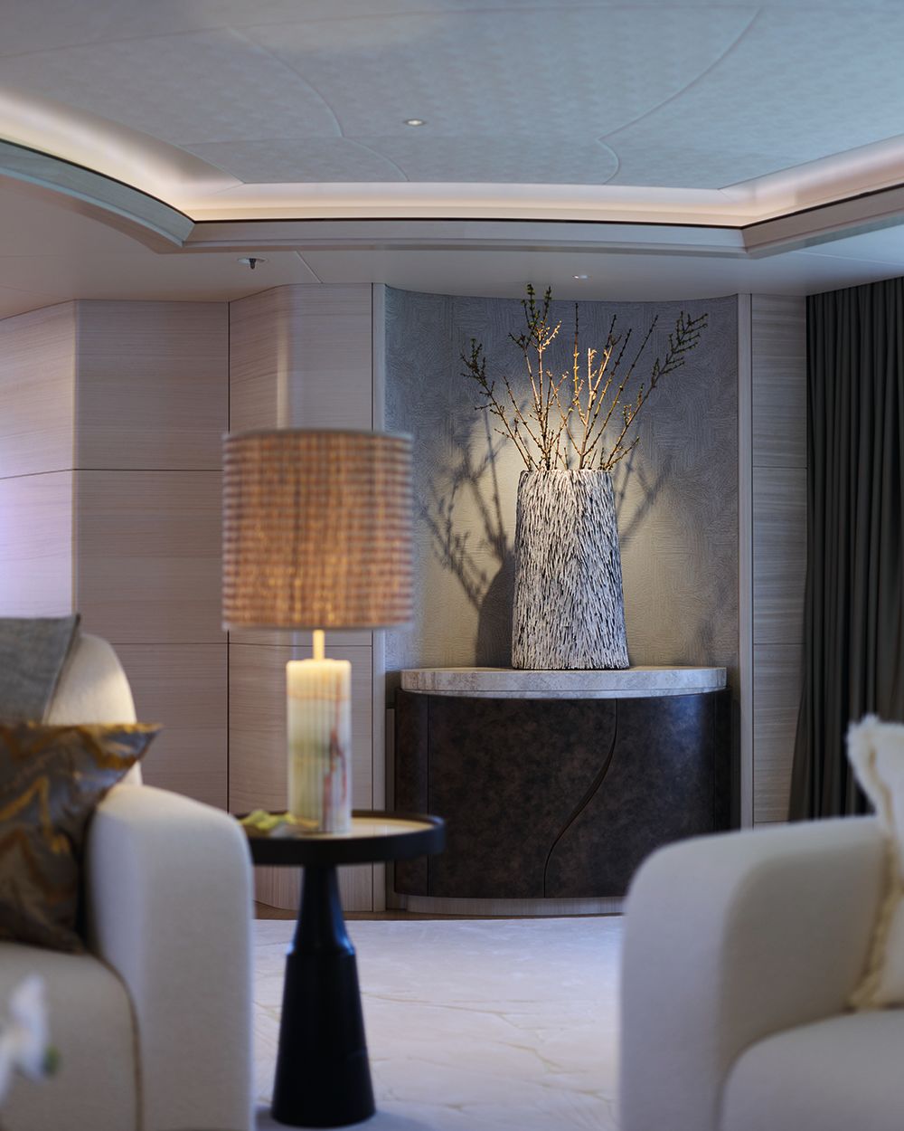
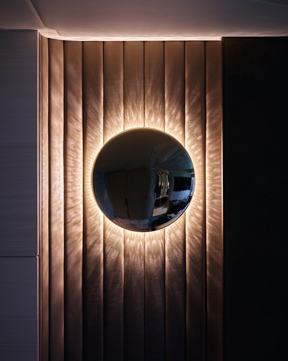
Looking around this large room, which combines a relaxing sofa area with dining for 12, I am struck by the fact that there are no hard edges to be seen – from chairs to cabinetry; trunking to tables, everything is rounded.
DAVID CHURCHILL
DAVID CHURCHILL
DAVID CHURCHILL
DAVID CHURCHILL
WINCH DESIGN
WINCH DESIGN
DAVID CHURCHILL
DAVID CHURCHILL
DAVID CHURCHILL
DAVID CHURCHILL
WINCH DESIGN
WINCH DESIGN
The coffee table resembles a slice hewn from the trunk of a giant redwood tree and is inlaid with fine green and copper-coloured marble (top left); the dining table chair backs are embossed with real palm leaves (top centre); bespoke lighting adorns each room, such as the wall lights in the twin children’s cabins (bottom right)
Senior designer Julia Roestenberg from Winch is on hand to explain: “It’s not feng shui. The client liked soft details and safe design suitable for kids. We decided to use it as a design feature throughout.”
Everywhere your eyes come to rest there is something new to fire the senses. The dining chairs, for instance, feature a broad leaf pattern on the back, which is echoed in the carpet around the dining table.
“They’re palm leaves embossed on the chair backs, made in Brazil. They needed to be huge leaves, naturally dyed with all their natural imperfections. It had to look high-end but remain a natural material,” says Roestenberg. “I don’t know if I’ll ever try to do that again!” I ask her why, and she mentions a prodigious quantity of leaves that simply weren’t suitable for the design.
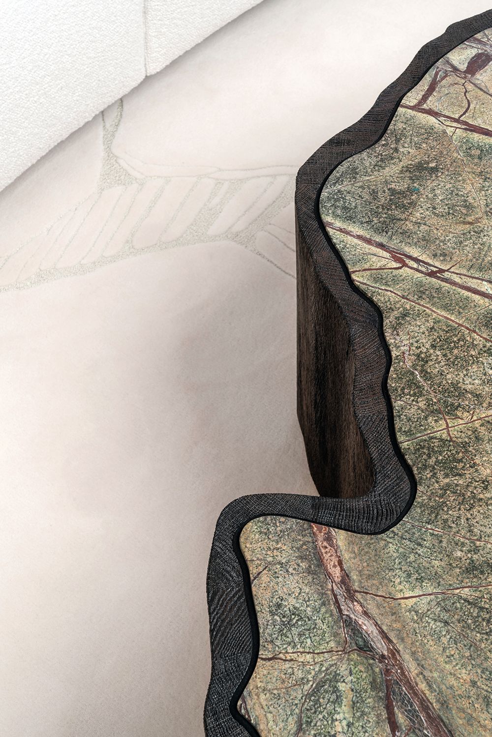
The dining table has been sculpted from figured sycamore with a panel in the middle that moulds voluptuously down into a central support. But it is the coffee table that captures my attention.
It resembles a slice hewn from the trunk of a giant redwood tree and is inlaid with fine green and copper-coloured marble, while the carpet around it continues its cracks and fissures.
No forest behemoths were harmed in the making of this boat, however, as Alex Hull of Hull Studio explains: “The coffee table had to have the feel of a large tree trunk, but it’s built of lots of bits of solid wood one to two inches thick.
“It’s hollow in the middle and the whole table can move on its base and around its stone top. The grain is really heavily brushed to keep that organic texture to it. But the nature of that stone and its veining are purely down to the marble, which Marmor Hotavlje in Slovenia selected for us.”
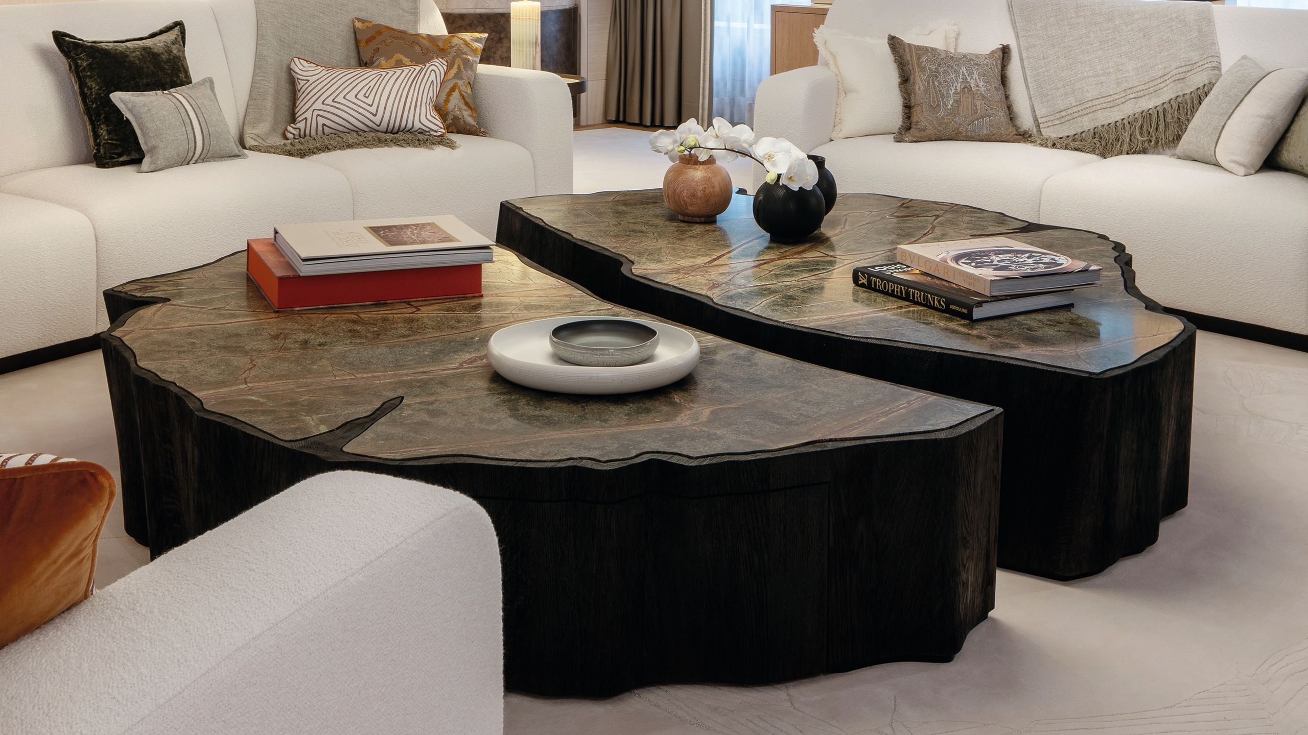
DAVID CHURCHILLWhile the saloon’s coffee table has the look of a redwood tree trunk, it’s actually made up of many small bits of wood and is hollow in the centre
DAVID CHURCHILLWhile the saloon’s coffee table has the look of a redwood tree trunk, it’s actually made up of many small bits of wood and is hollow in the centre
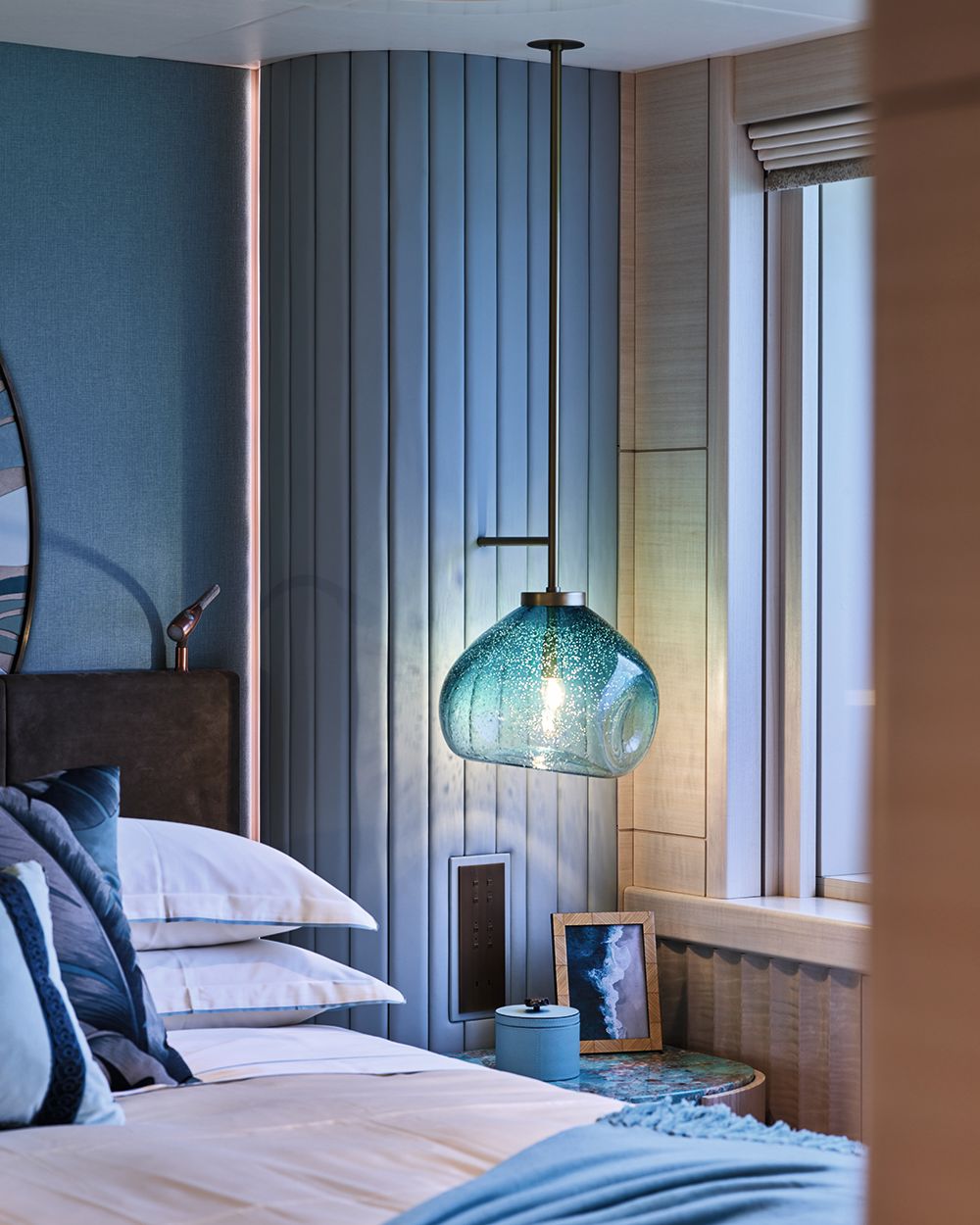
Unusually, guest accommodation is also found on the main deck, including two cabins designed specifically for children. With their size, they could be VIPs, but they contain some carefully thoughtout features for little people.
Here more than anywhere else, the Tai Ping carpets have been built up in layer upon colourful layer, forming waves. “There are 20 colours and five layers,” confirms Roestenberg. “The owners initially wanted 100 per cent silk carpets, but the owner’s representative vetoed that for longevity reasons.”
WINCH DESIGN
WINCH DESIGN
An island has been woven into the middle of the carpet to fire up young imaginations, and a beautiful vellum-covered screen can be slid back into the wall to transform the two cabins into one huge playroom.
WINCH DESIGN
WINCH DESIGN
A soft, upholstered stool loosely assembled from polygons looks designed to captivate a child. The detail is breathtaking. “The owners wanted their yacht to be playful and to feature something people have never seen before,” explains Roestenberg.
“There are no hard edges to be seen. The client liked soft details and safe design suitable for kids”
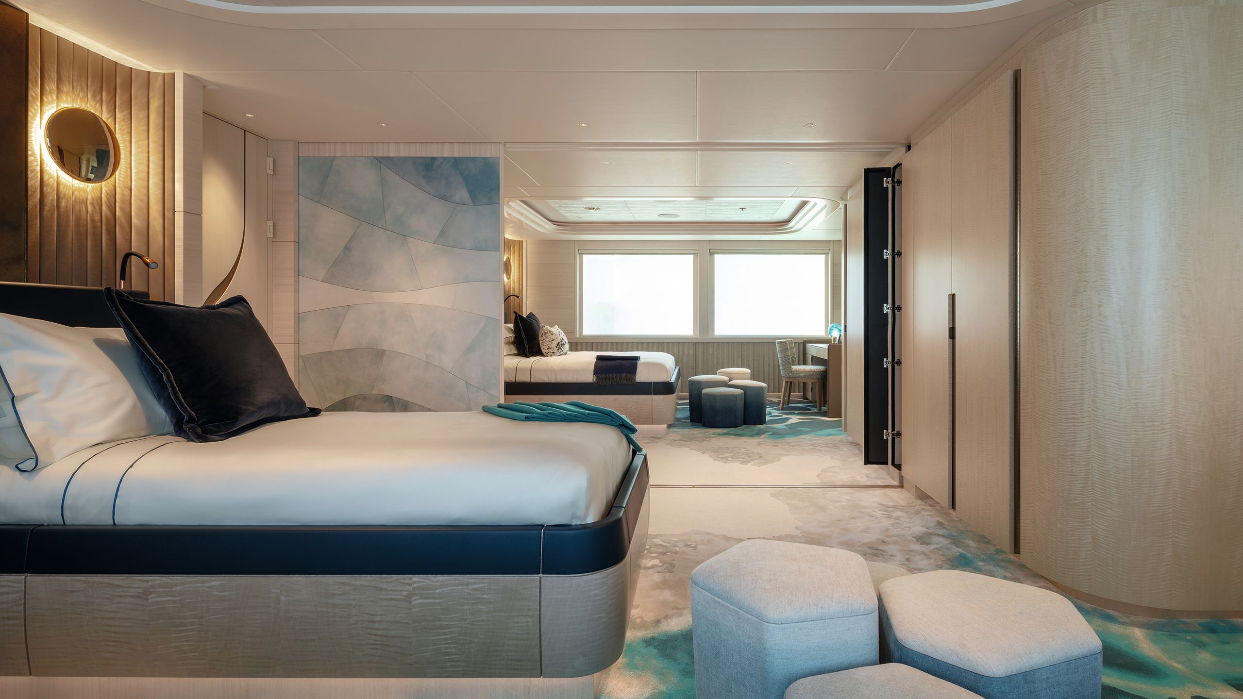
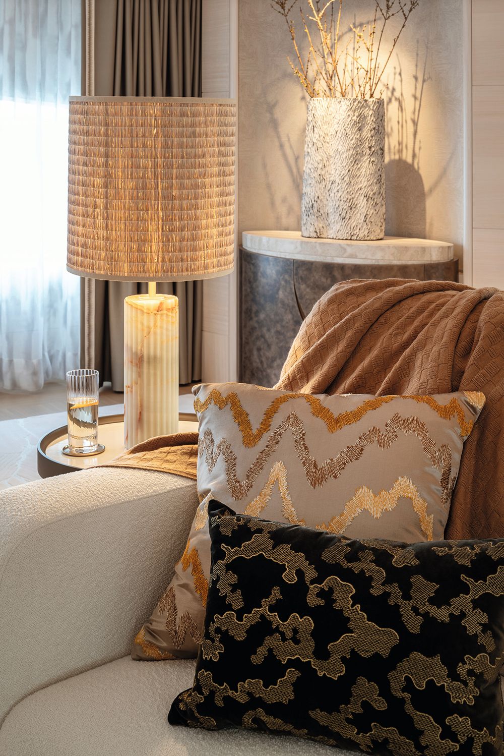
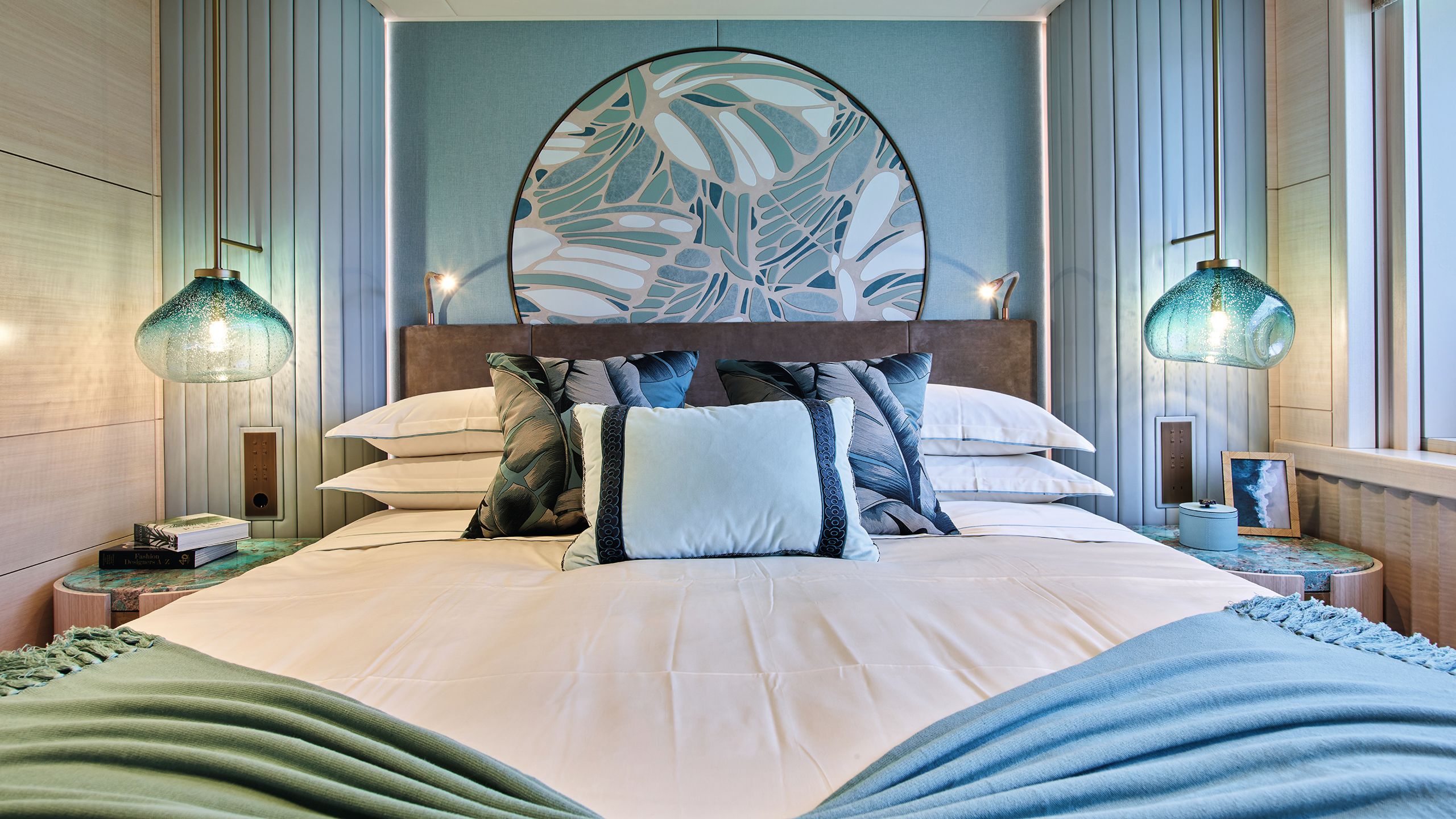
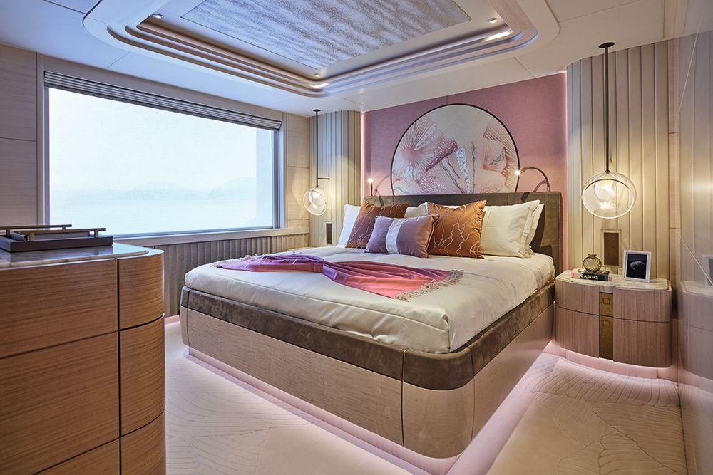
Each of the four guest cabins have been designed around a different theme, which is picked up in the colours of the bespoke lamps, carpet and upholstery, and especially in the headboard above the bed.
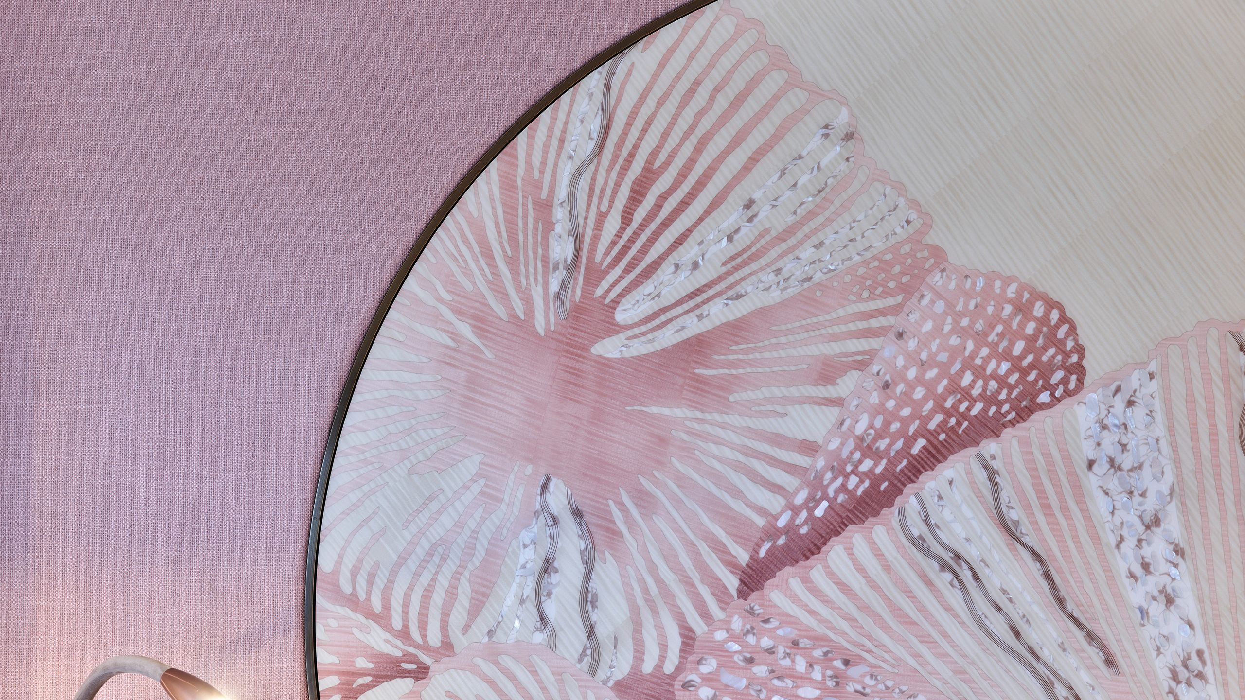
In one it’s pink petals, with leaves embossed into the carpet and a fantastically complex piece of marquetry on the headboard, picking out the details in a peony.
In another, it’s the patterns of a butterfly’s wings embroidered onto the headboard, and in the carpet. It is certainly at odds with today’s overriding trend towards bland, neutral interiors, and the artisanship is astonishing. It won’t please everyone, but it’s hard to resist a sense of wonderment at the skill involved.
WINCH DESIGNThe headboard in the pink guest cabin is a complex piece of marquetry that picks out the details of a peony
WINCH DESIGNThe headboard in the pink guest cabin is a complex piece of marquetry that picks out the details of a peony
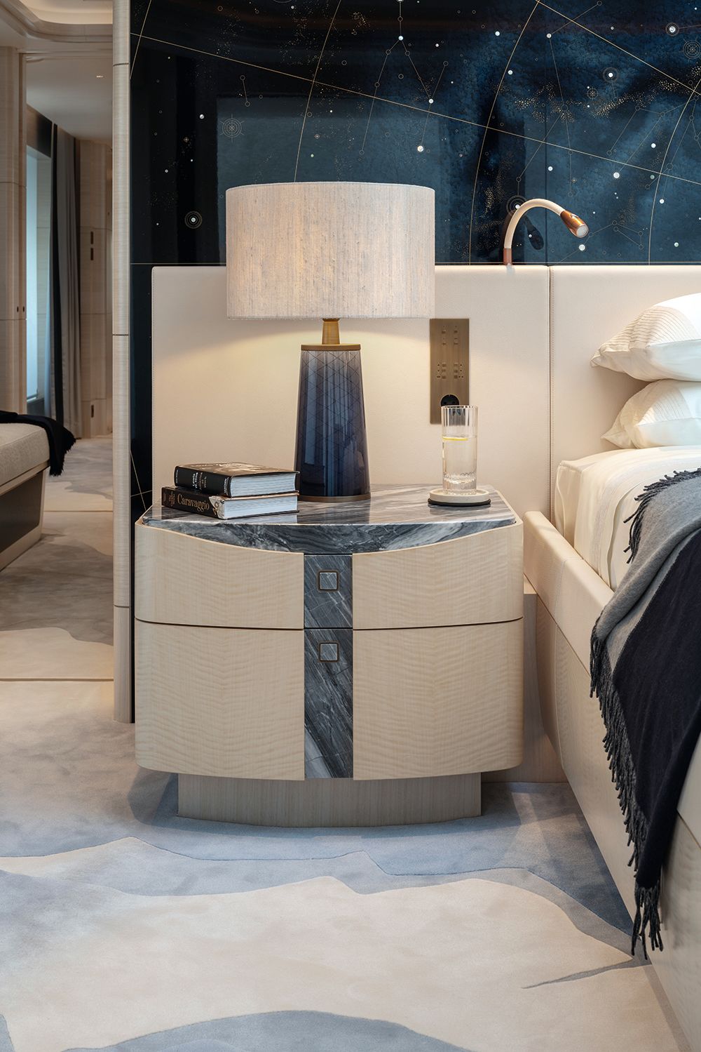
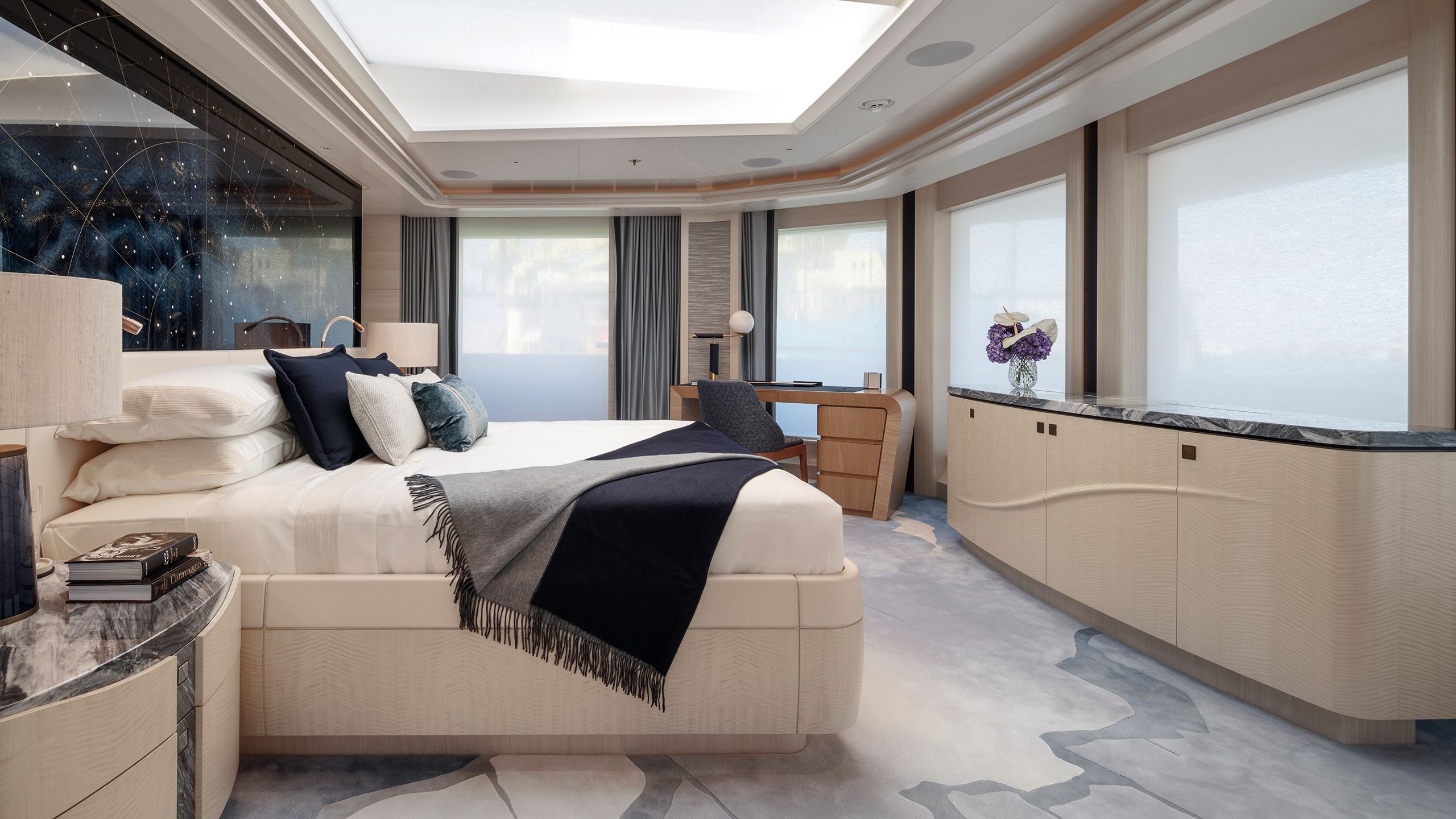
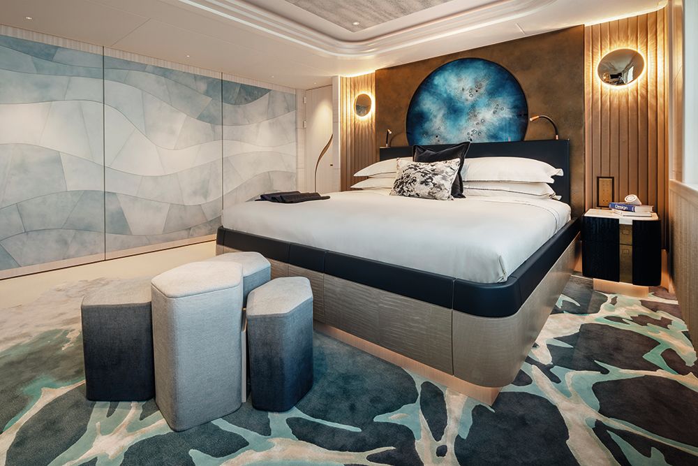
Naturally enough, the owner’s suite is the source of the greatest awe, positioned forward on the dedicated upper owner’s deck.
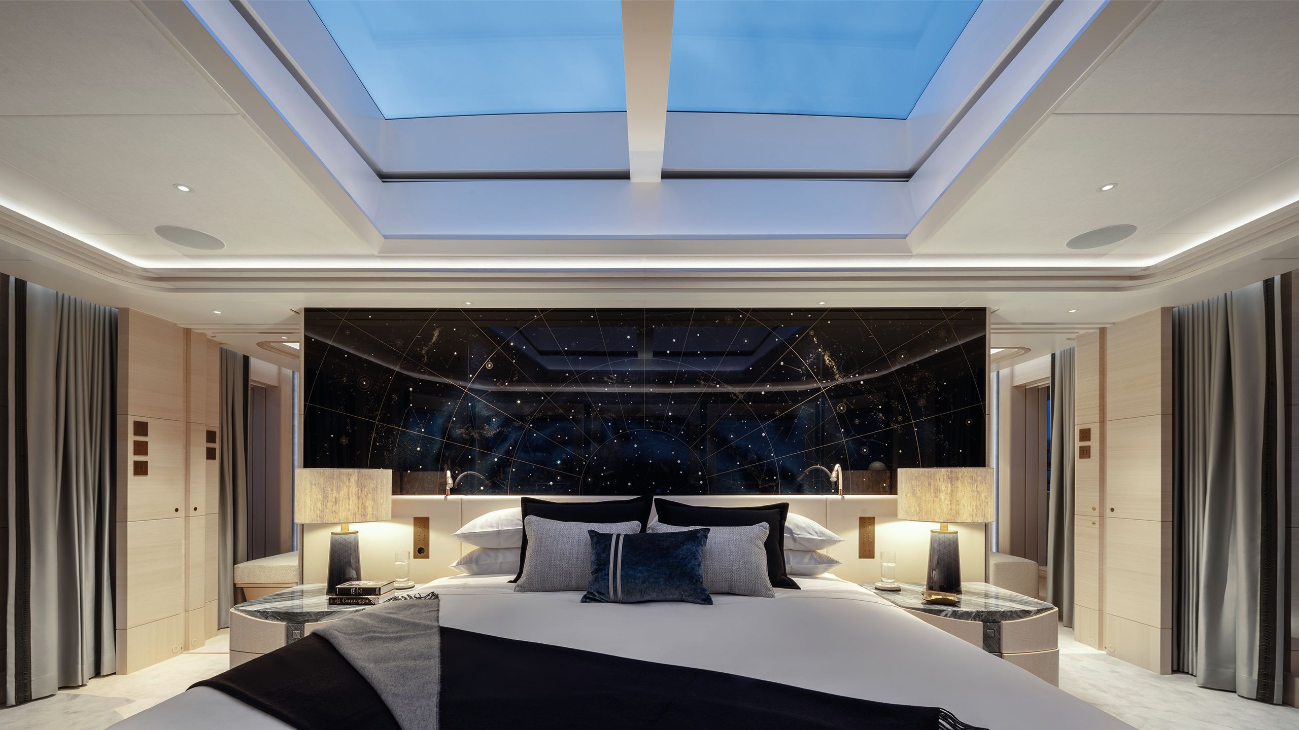
Its king-sized bed (with rounded corners, of course) commands 180-degree views ahead and boasts a skylight above. But it’s the vast star map of mother-of-pearl and gold paint inlaid to a midnight-blue oak panel above the bed which stops you in your tracks.

“It’s an accurate constellation map, showing real stars, but it doesn’t have a particular meaning,” says Roestenberg. “There are no coded messages in there! The skylight is an additional ray of light to bring the inside out and correlate with the constellation theme. It provides the option to contemplate the stars at night.”
DAVID CHURCHILL
DAVID CHURCHILL
DAVID CHURCHILL
DAVID CHURCHILL
DAVID CHURCHILL
DAVID CHURCHILL
Alex Hull is behind the star chart above the owner’s bed. He built a timber panel, dyed it a rich midnight blue, then engraved golden lines and inlaid mother-of-pearl stars into it to recreate a map of the heavens. The grain of the wood and subtle variations in the dye give the effect of a star-spattered Milky Way
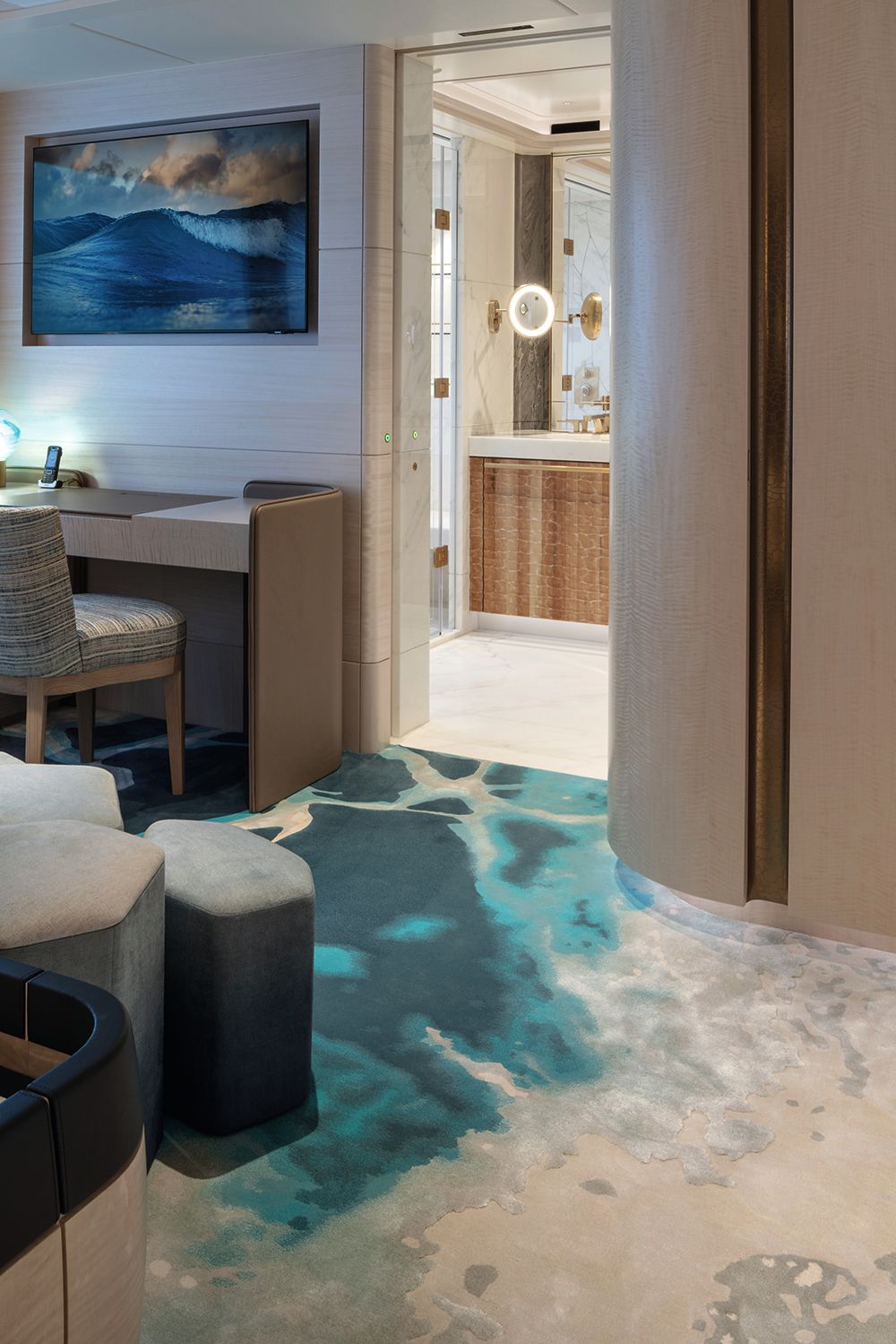
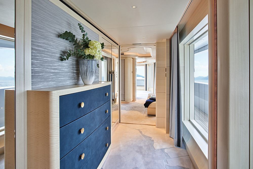
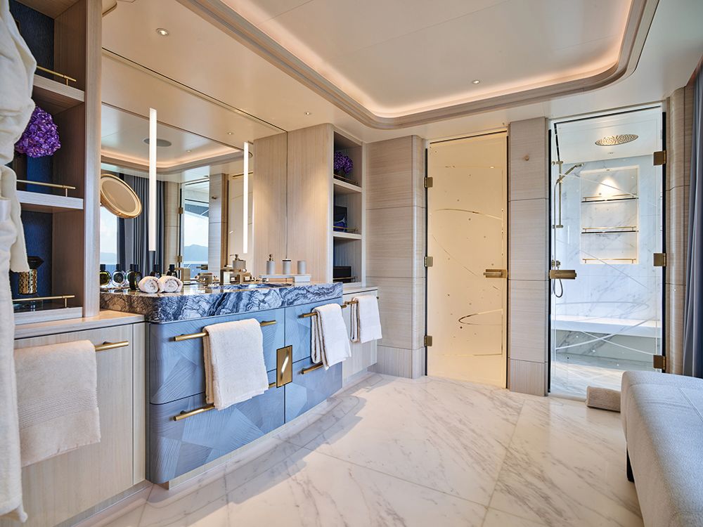
Twin sliding doors give access to a private owner’s lounge on the foredeck, and there’s a vast master bathroom. The owner’s domain also runs to a big walk-in dressing area and a discrete lobby, before giving way to a second equally impressive owner’s cabin aft.
DAVID CHURCHILL
DAVID CHURCHILL
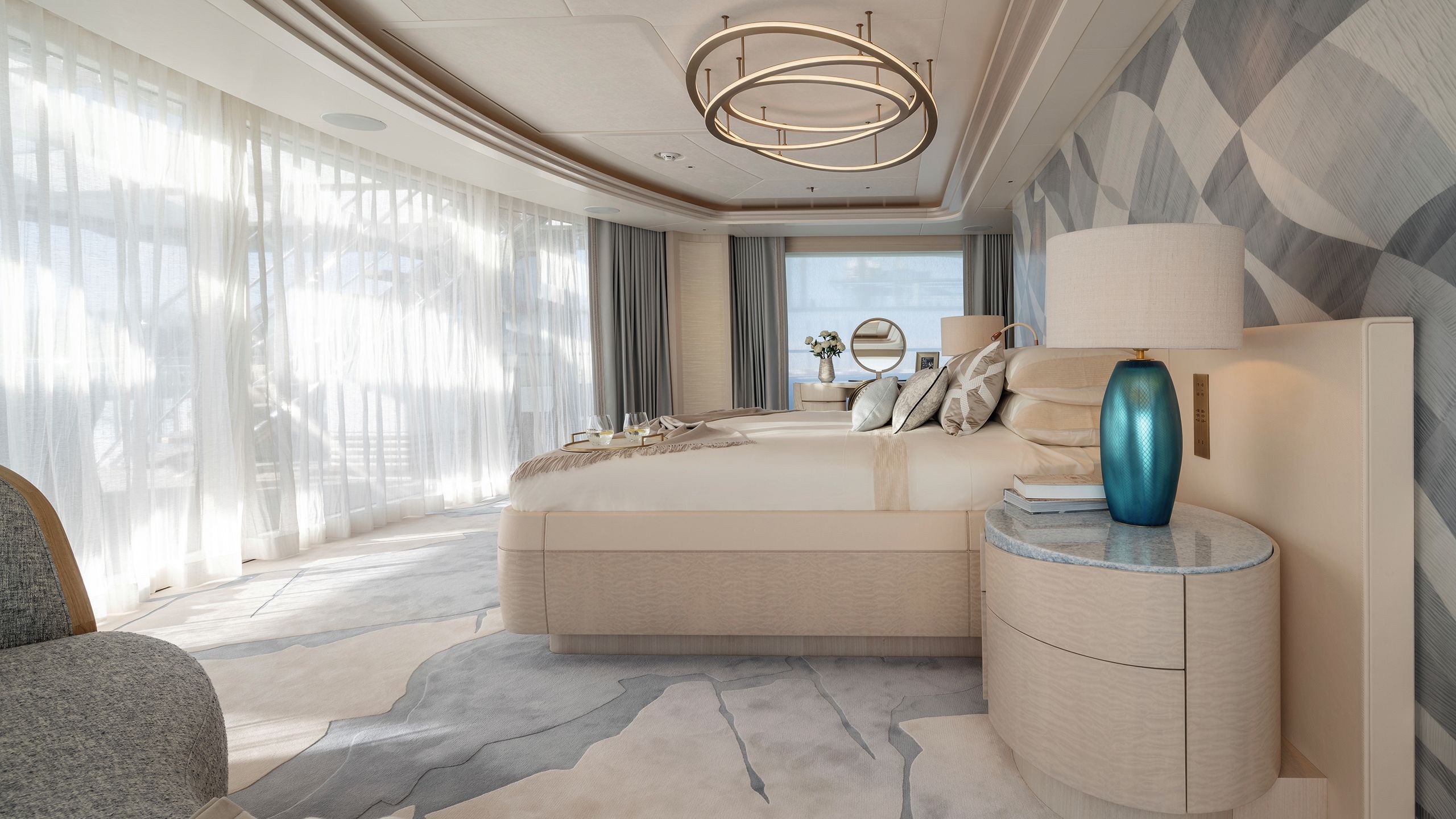
The bed is the same size, and a large-radius sliding glass door aft parts onto an exclusive dining and lounging area, with an extendable table where up to 10 people can share a meal. It’s easy to imagine a lazy family breakfast in the morning sunshine as the plans for the day are hammered out.
WINCH DESIGN
WINCH DESIGN
WINCH DESIGN
WINCH DESIGN
DAVID CHURCHILL
DAVID CHURCHILL
DAVID CHURCHILL
DAVID CHURCHILL
The owner’s deck boasts not one, but two owner’s cabins, one forward (and one aft, both with glorious views over the deck and sea beyond. The forward cabin has exclusive access to a private terrace on the foredeck and each of the four guest rooms has been given its own character
Even in the watery winter sunlight of my visit, it is clear great effort has been made to develop a common look and feel from inside to outside, ensuring you can step from one to the other and barely notice.
Furthermore, the boat offers exceptional amounts of deck space. From a vast, well-protected sundeck with a spa pool, bar and loungers to the main aft deck with its pool and sweeping steps down to the open water at the beach club, no two areas do the same thing.
It is at odds with today’s overriding trend towards bland neutral interiors, and the artisanship is astonishing
“Our interior and exterior teams made a perfect synergy between the spaces,” says Roes. “Often when you work with a different exterior agency, they have a different agenda.
“It’s rare that the two areas marry so well. There are no thresholds between interior and exterior, and the main deck is a super social space with big sliding doors and a dining table; it feels neither inside nor out.”
DAVID CHURCHILL
DAVID CHURCHILL
DAVID CHURCHILL
DAVID CHURCHILL
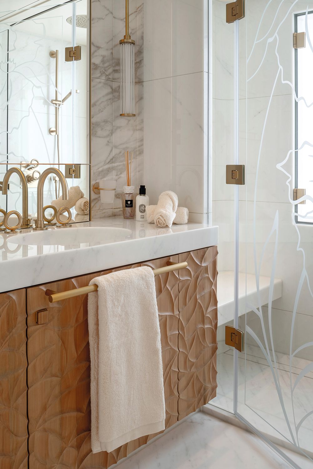
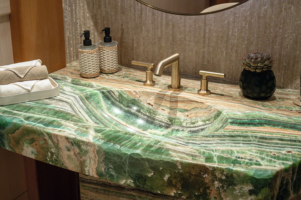
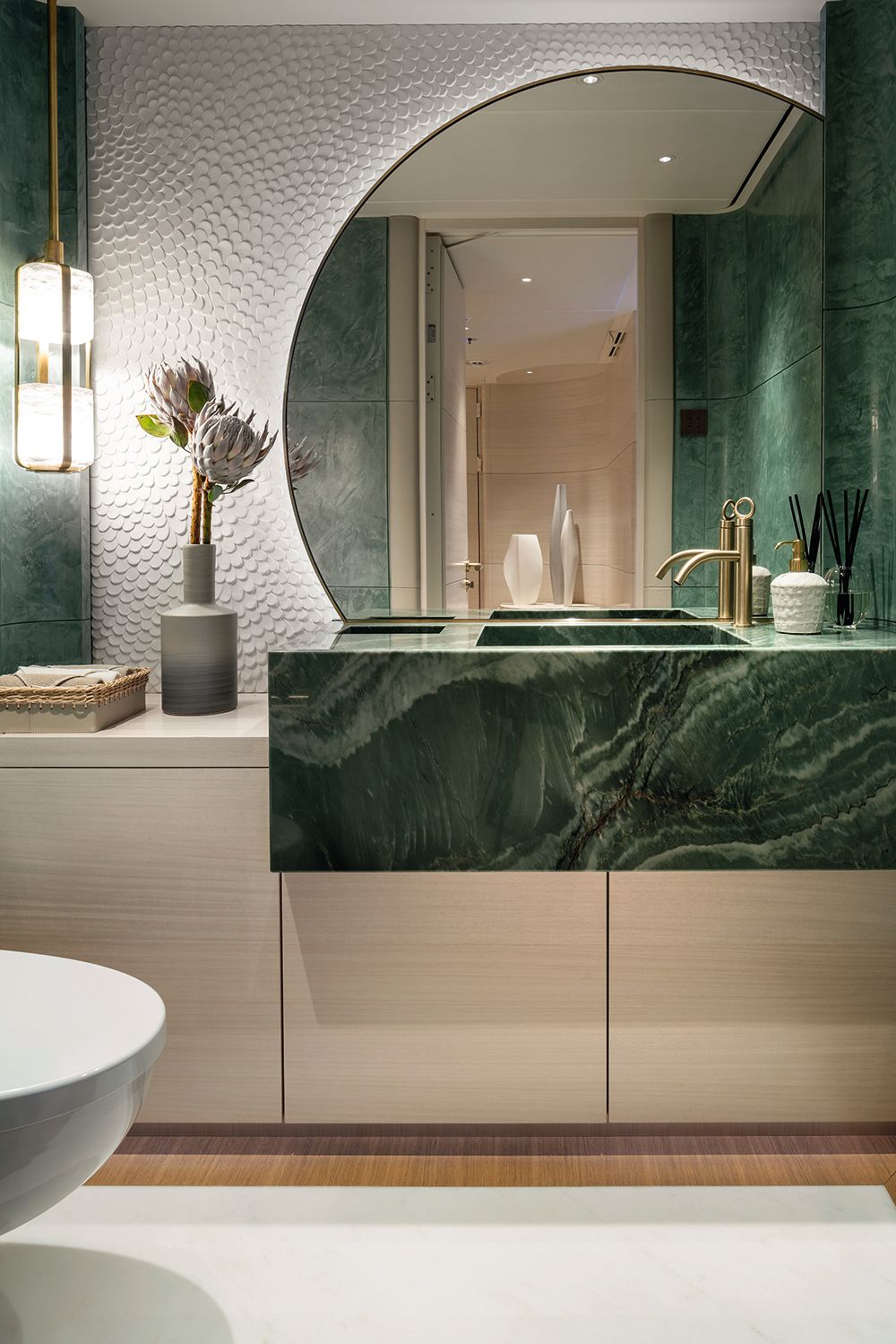
Each en suite is unique
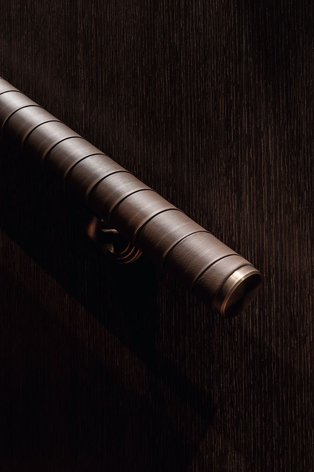
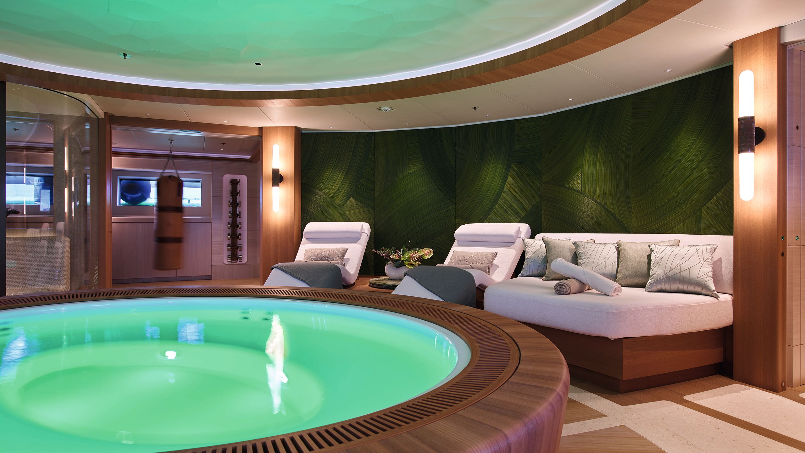
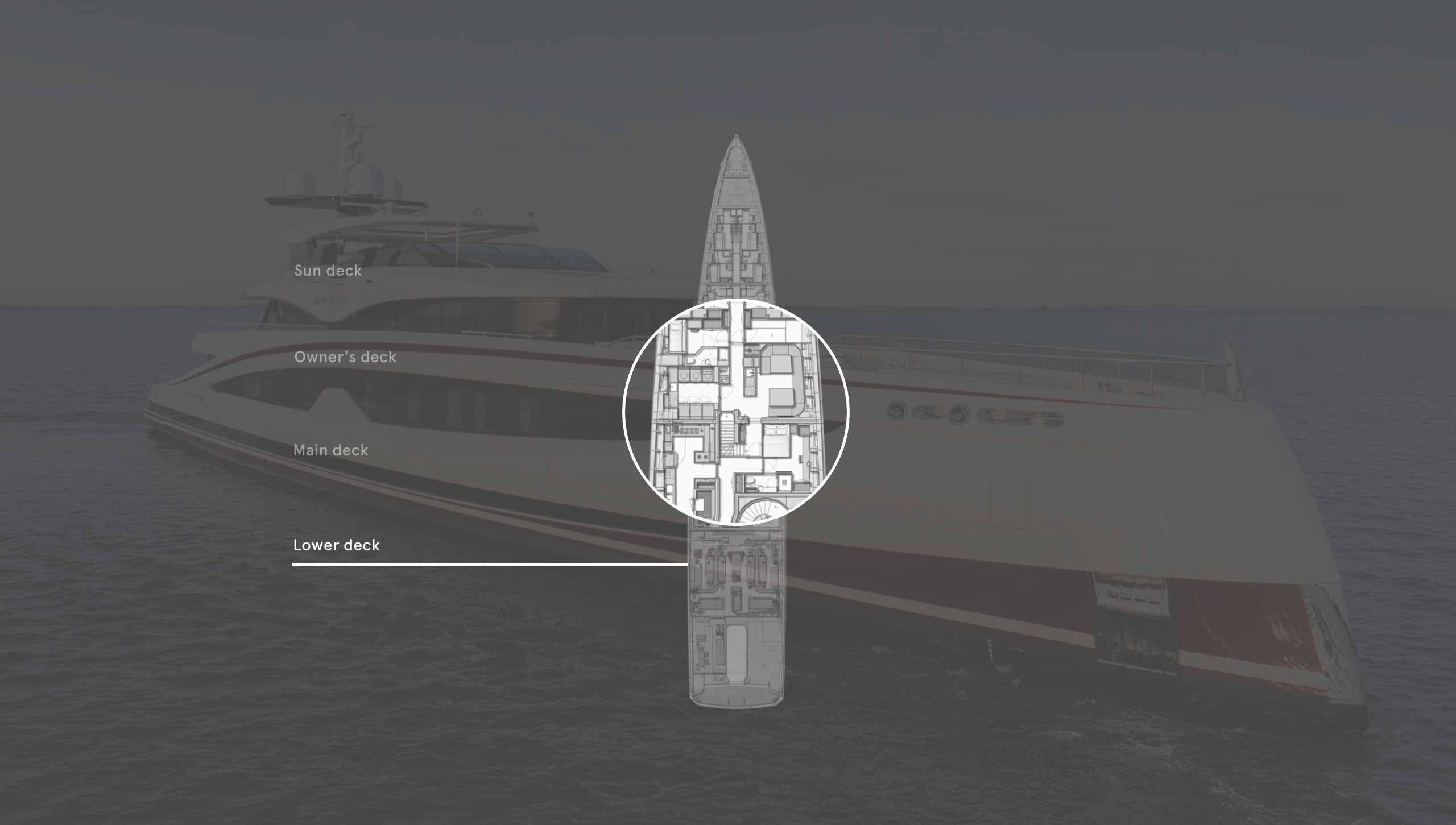
Sparta’s final secret is only revealed when we descend those glorious embossed leather stairs to the sole part of the lower deck conceived for guest use. Filling 65 square metres and running the full midships beam is a gym and spa finished to a level bordering on perfection.
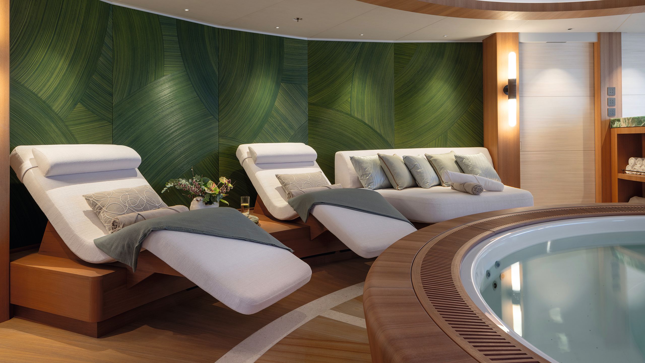
Here there’s a Japanese theme, with a large circular wood panelled spa pool taking pride of place in the middle. It is actually slightly recessed into the floor, to lower the sight lines of those soaking and make it more natural to hold a conversation with those on the built-in loungers.
WINCH DESIGN
WINCH DESIGN
DAVID CHURCHILL
DAVID CHURCHILL
DAVID CHURCHILL
DAVID CHURCHILL
DAVID CHURCHILL
DAVID CHURCHILL
DAVID CHURCHILL
DAVID CHURCHILL
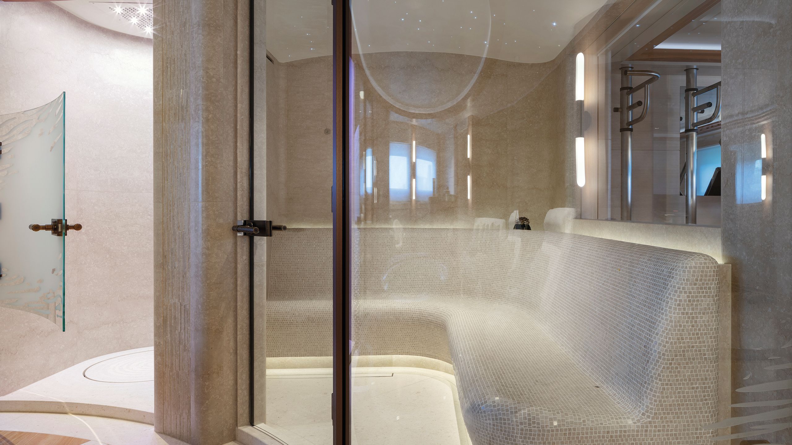
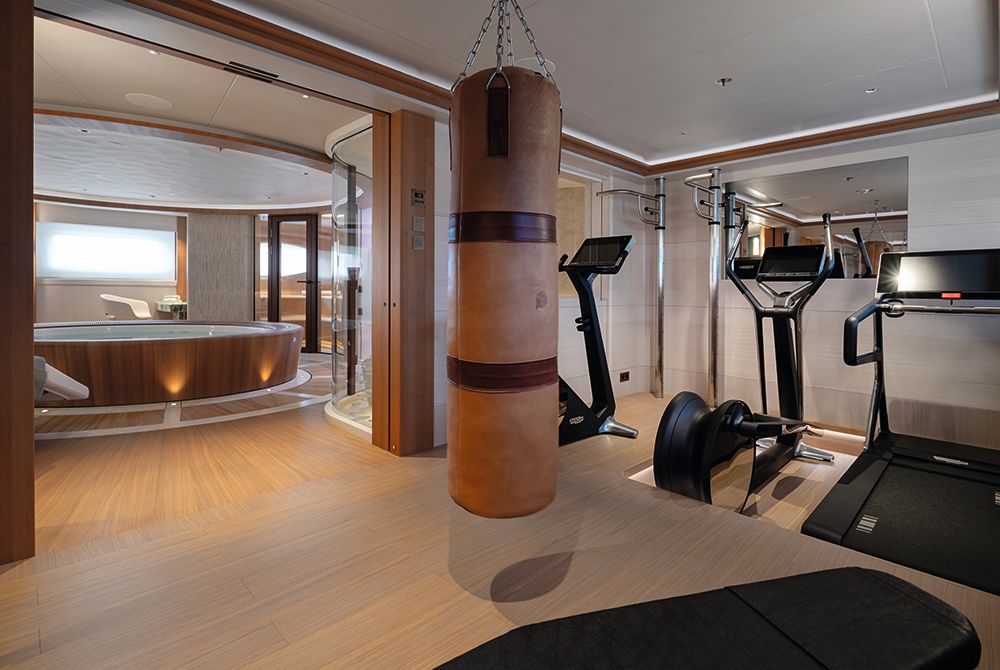
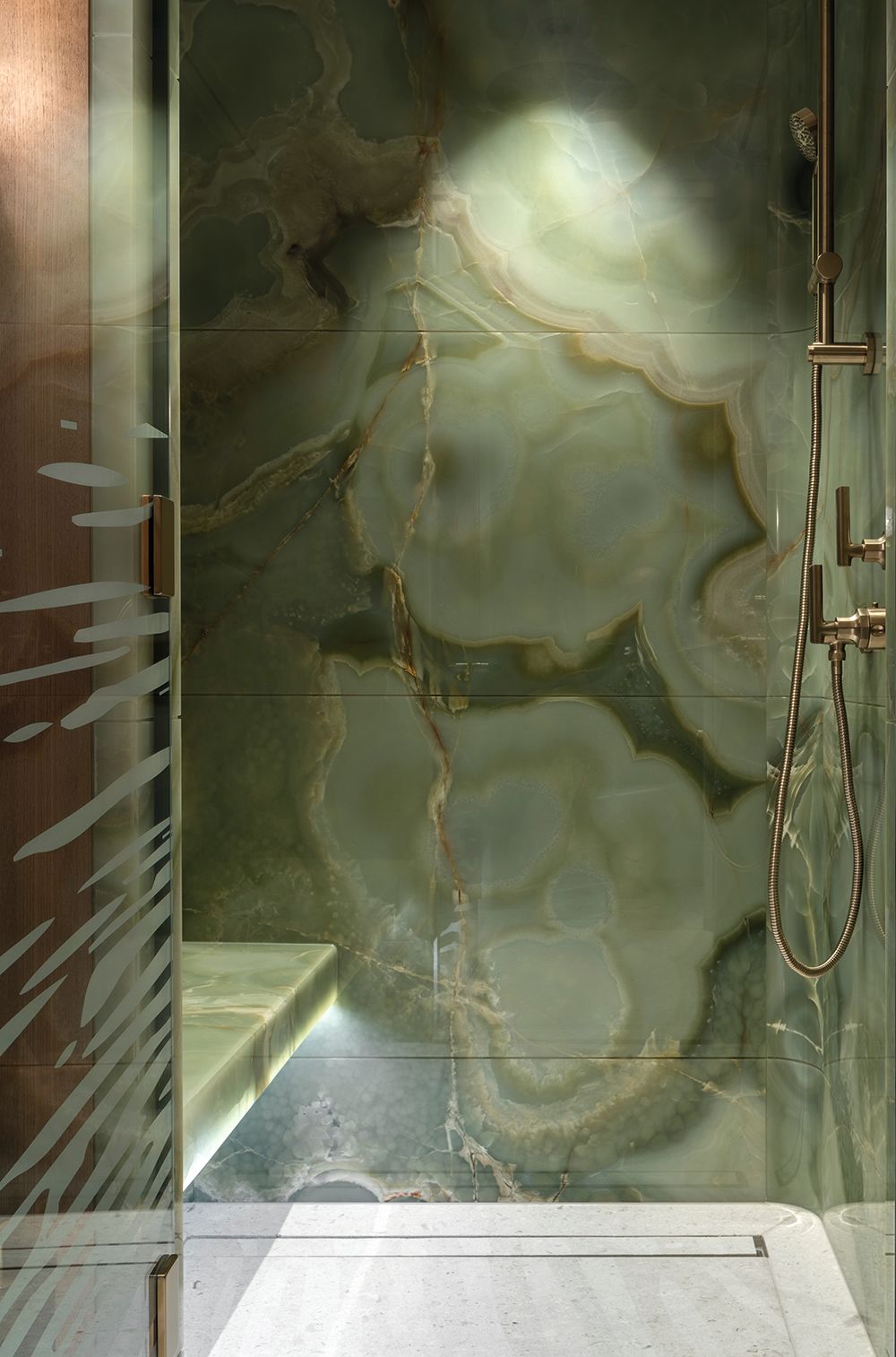
Details like the dramatic jade-veined marble and lamps with patinated bronze switches help give the spa a Japanese character. Workout equipment lies adjacent to a fully kitted-out spa that includes a steam room, sauna and experiential shower
There’s a sauna, too – a work of curved art in its own right, but also a demonstration of the lengths to which the design team went in order to find solutions.
“It is panelled with hemlock wood planks,” says Roestenberg. “Cedar is much more common, but it has too much dark-light striping.” Hemlock wood, I should point out, is a conifer found in North America and nothing to do with the poisonous European plant.
Filling 65 square metres and running the full midships beam is a gym and spa with a Japanese theme
Besides an experiential shower and mosaic-lined Turkish steam room with curving glass walls, a gigantic open–plan gym is the final element, and it is designed as a key social area.
There’s room for an exercise bike, cross-trainer and treadmill, as well as a punching bag, wall-trainer and even a massage table. Simply put, it is one of the largest gym and spa outfits on a yacht of this size.
WINCH DESIGN
WINCH DESIGN
The centrepiece of the lower-deck wellness area, the spa pool is slightly recessed into the floor so those soaking can easily converse with those lounging
For all that she represents an extraordinary home on the water, Sparta is technically quite conservative – impeccably put together by a shipyard at the top of its game, but without experimental or innovative solutions.
Her main propulsion comes from two well-proven MTU 12-cylinder diesel engines that put out a combined 3MW of power.
RUBEN GRIFFIOEN
RUBEN GRIFFIOEN
They give her a maximum speed of just under 18 knots, but a globe-trotting range of 5,000 nautical miles – thanks in no small part to the vast 140,000-litre tankage.
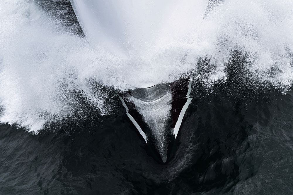
Sparta’s dramatic reverse bow and taut lines give the boat incredible wave-piercing power and impressive stability.
“We designed a slender hull to get more draught and less freeboard,” says Heesen’s head of design and engineering, Peter van der Zanden, who had to ensure that the boat would fit under the many bridges that separate the shipyard in Oss from the North Sea.
DAVID CHURCHILL
DAVID CHURCHILL
“The bow is an aesthetic choice but delivers additional comfort for the passengers, with reduced acceleration in wavy sea conditions, and therefore reduced motion sickness.
“Our naval architecture is based on the fast displacement hull form (FDHF) devised by van Oossanen, which delivers 20 per cent less fuel consumption compared to a round bilge.”
RUBEN GRIFFIOENVan Oossanen’s Fast Displacement Hull Form improves fuel efficiency by 20 per cent over a round bilge, which helps deliver Sparta’s very long range
RUBEN GRIFFIOENVan Oossanen’s Fast Displacement Hull Form improves fuel efficiency by 20 per cent over a round bilge, which helps deliver Sparta’s very long range
With the sun up, now, it’s easier for me to appreciate the slick exterior of the boat, with that “swoosh” – a flattened S-shaped curve picked out in red that runs from stem to stern.
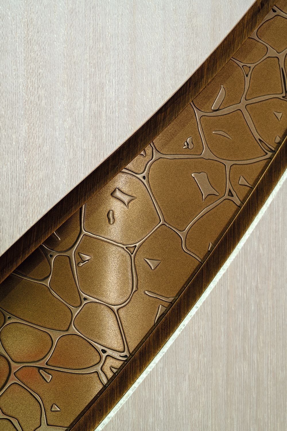
It’s a motif that is repeated in the joinery and detailing throughout the boat’s interior, as well as in the eight-metre tender custom built by Tenderworks to reflect the mothership’s design. The fairing is immaculate and, thanks to the precision of the underlying hull, very thin.
All the same, Heesen says certain design features made Sparta challenging to build. “Being long and thin, longitudinal strength was a challenge,” says van der Zanden.
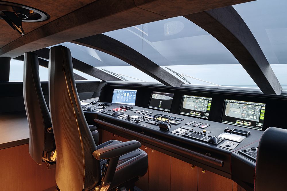
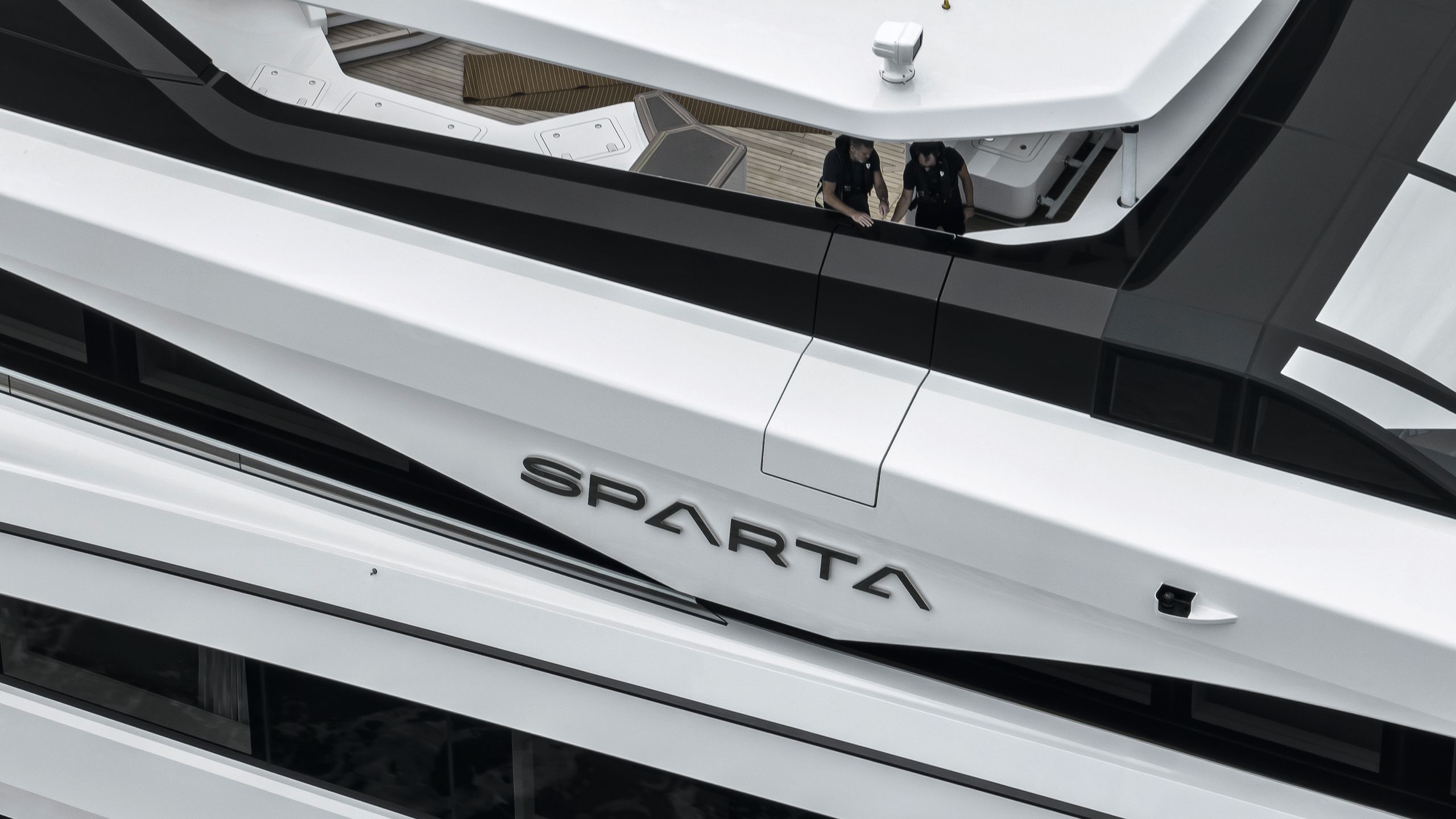
“Also, the wide-body made the design of the first layer of the superstructure difficult, and the wing stations had to fit into the heavily bevelled shape of the boat. We made them slide out to gain the necessary visibility.”
RUBEN GRIFFIOEN
RUBEN GRIFFIOEN
But perhaps the tallest order was that Winch interior. Heesen’s achievement here is beyond reproach, but I sense that it required even greater attention than usual for the fitters.
There’s a trace of it in van der Zanden’s voice as he tells me: “The organic shapes of the sauna were challenging to build and the sliding partitions in the VIP cabins are also a complex piece of art.”
Inevitably, we’ve come full circle – back to Sparta’s breathtaking styling. The tragedy of this project is that the yacht is already for sale, as the build owners have had to back out.
And yet, their mark is everywhere aboard; every fibre of Sparta has been bent towards their vision of the perfect family boat. Anything but Spartan, as it turns out, this is surely a yacht that will not have to wait long to find a new family.
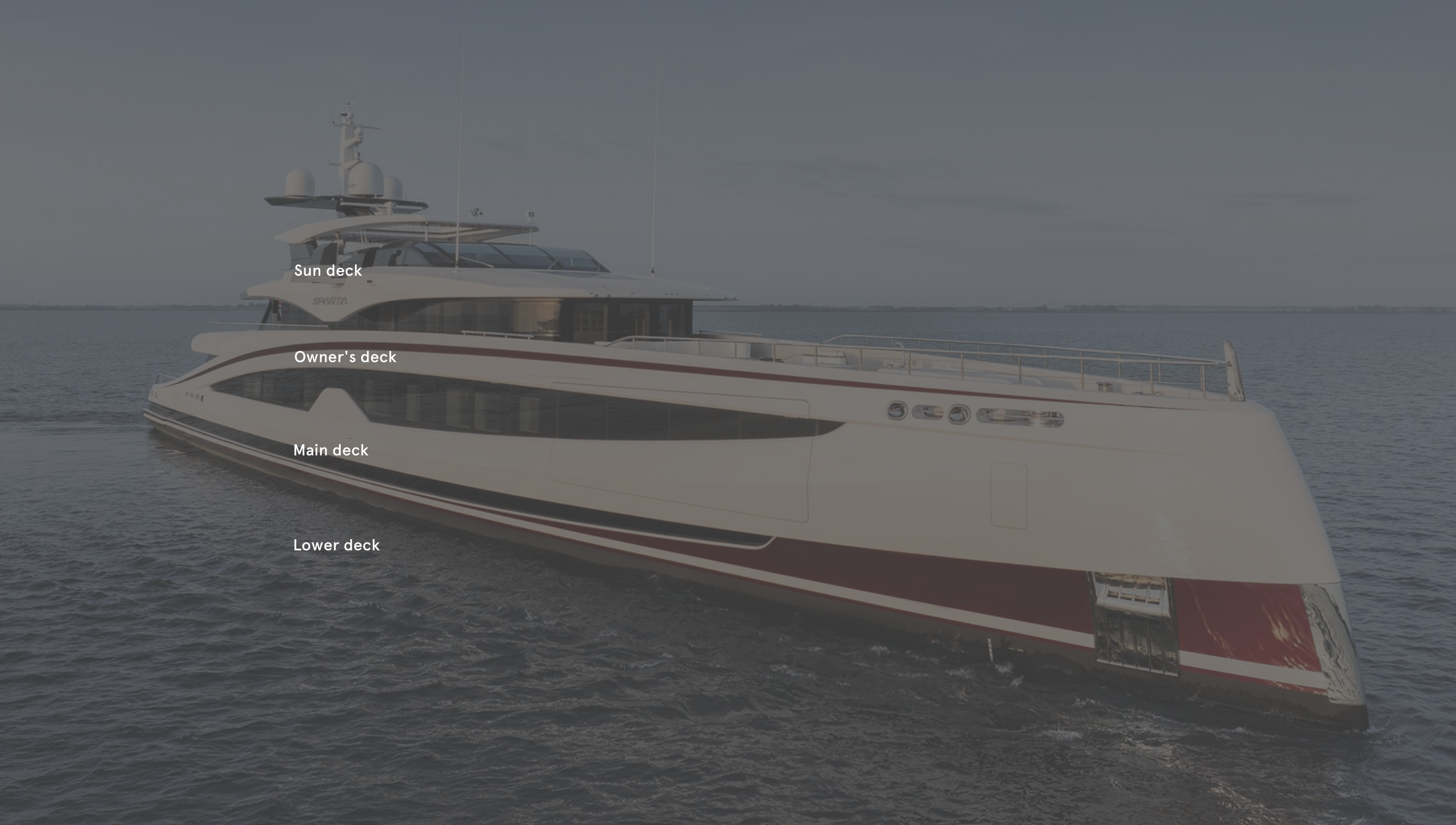
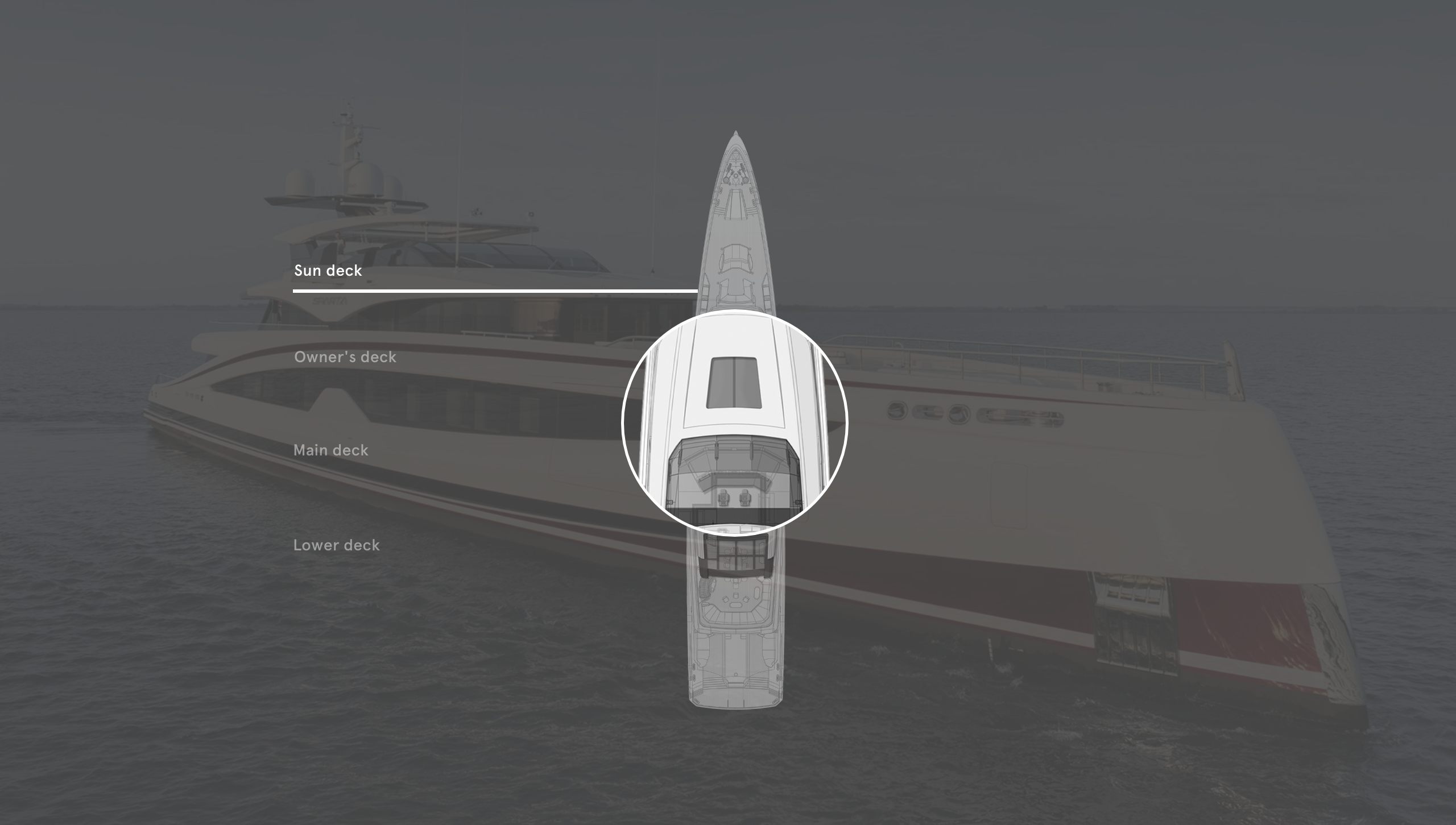
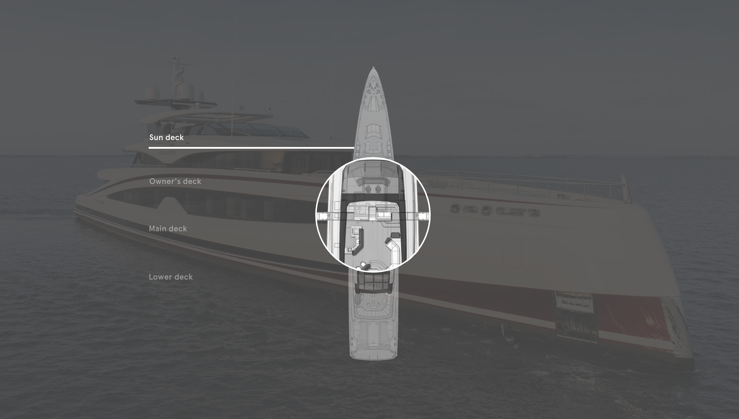
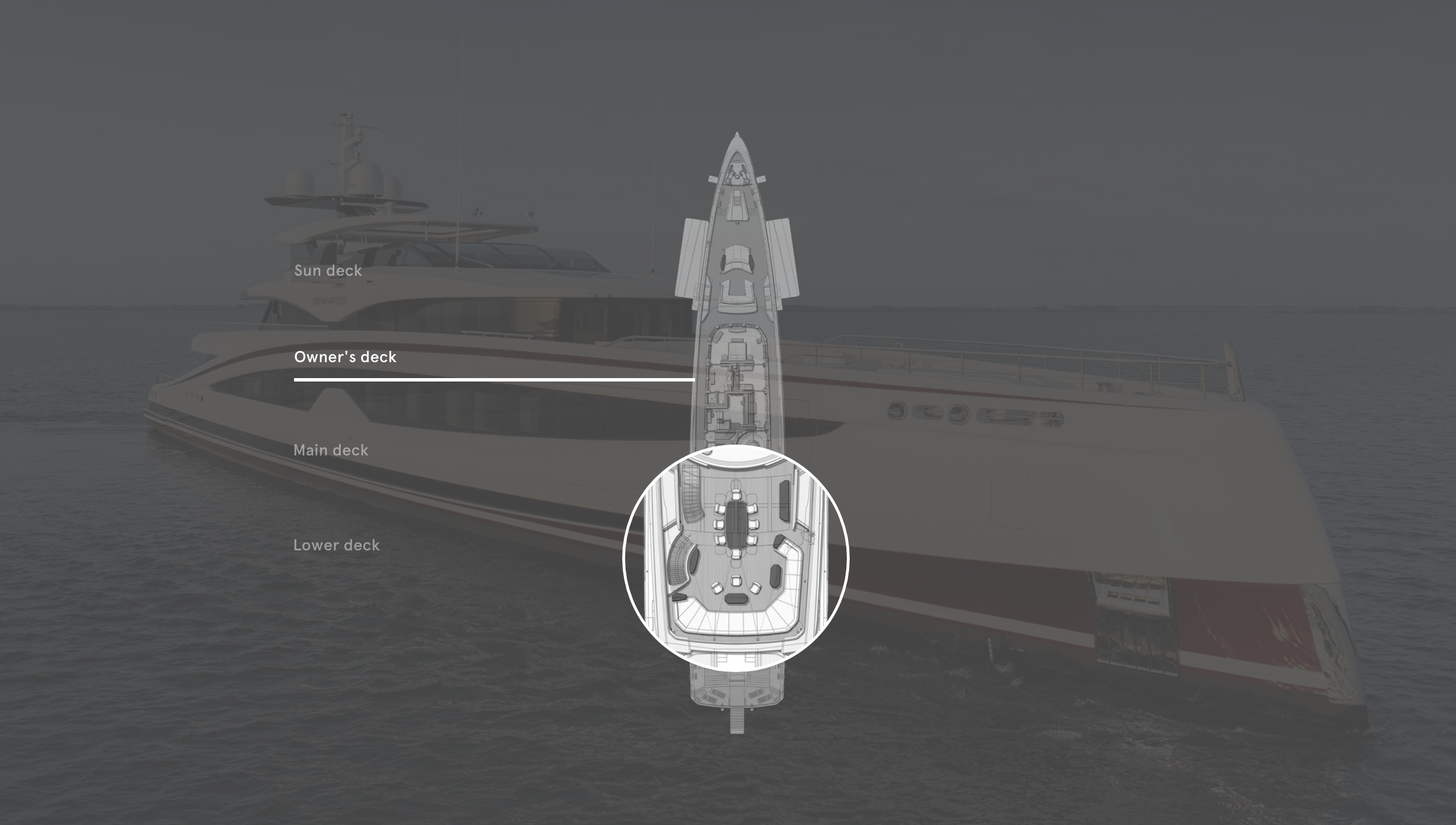
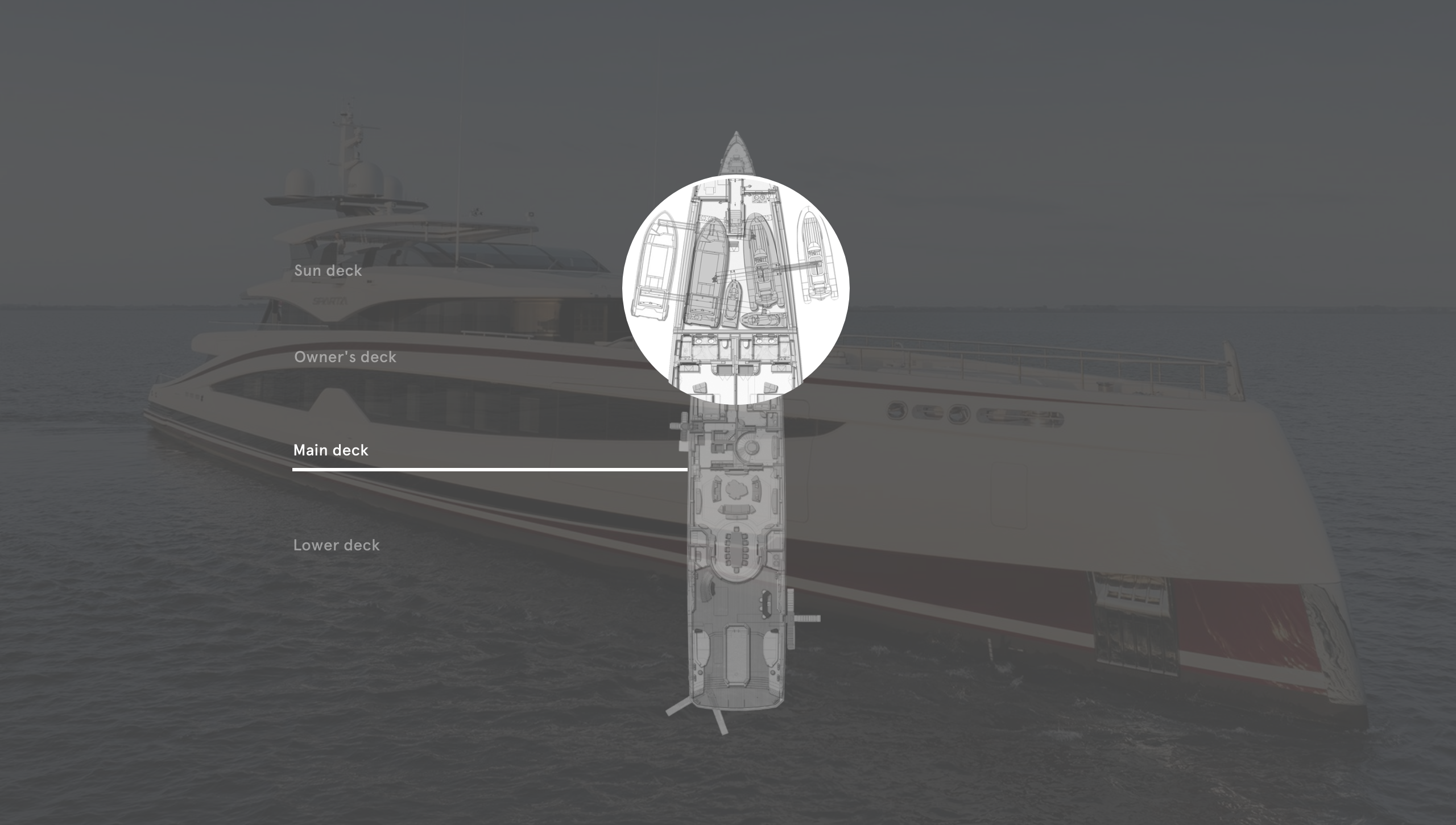
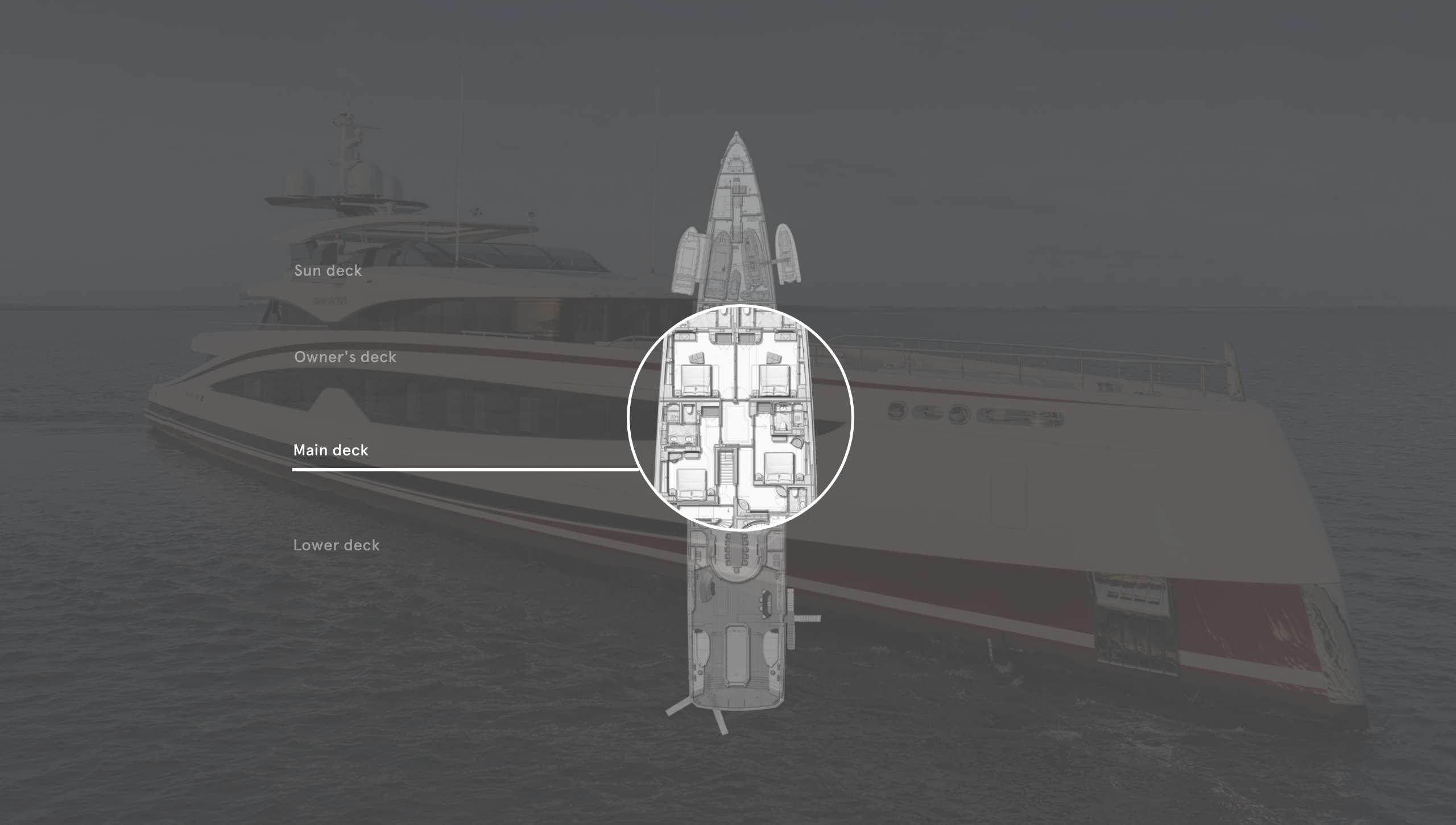
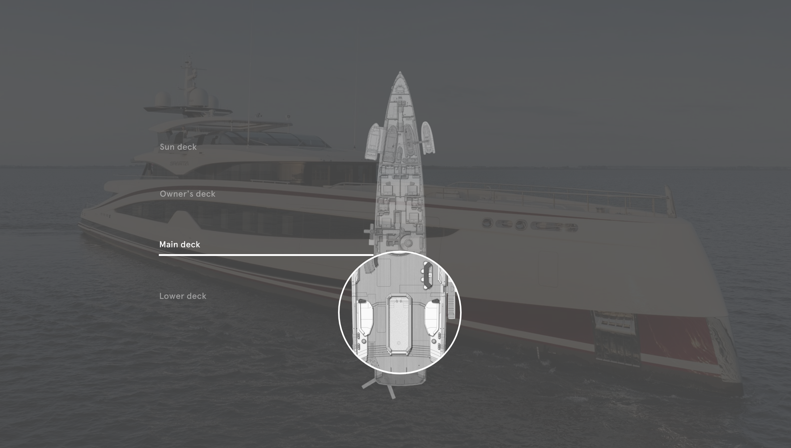
A skylight brings extra light into the forward owner’s cabin
Hydraulic wing stations slide 2m out for visibility in close-quarters manoeuvring
The aft owner’s cabin enjoys a private deck for al fresco meals
Overhead cranes deploy the two luxury tenders as well as two water scooters
The two forward guest cabins can combine into one very large room
A large pool anchors the main deck aft and features a mosaic of a Spartan helmet
The entire lower deck forward of the spa/gym is for the crew
LOA 67m | Gross tonnage |
LWL 66m | Engines |
Beam 11.5m | Generators |
Draught (full load) | Speed (max/cruise) |
Range at 14.6 knots | Owners/guests 12 |
Fuel capacity | Crew 14 |
Freshwater capacity | Construction |
Tenders | Classification |
Naval architecture | Builder/year +31 412 66 55 44 heesenyachts.com |
Exterior and interior design | For sale arconyachts.com |
First published in the May 2024 issue of BOAT International. Get this magazine sent straight to your door, or subscribe and never miss an issue.

